Showing posts with label outdoors. Show all posts

Wednesday, April 6, 2016

More spring photography from Instagram!

When a subject from nature interests me, I take the opportunity to take as many photographs as possible.  Building my photography collection for art references is a serious effort.  I'm sure I've mentioned this before but it's crazy true.  My obsession with attention to detail, watching for a perspective or angle that I can't pass up is always there.  In the past few days, I've checked on the cherry blossoms often and taken perhaps 200 photos...some turn out and some don't, so I go a bit overboard to allow for mess ups.  I've been experimenting with the backgrounds being less distracting and more blurred.  I'm also learning that the tripod needs to go along and be put to good use!  New habits 101...


I'm excited to share a few more photos from our afternoon drive in the Lewis and Clark National Forest.  We just say, "let's take a drive up the Teton."  The fresh, clean air and big, blue sky combined with the scent of pine is just a rejuvenating way to escape regular life stuff for a while.


See you tomorrow!  I'm preparing to share some useful tips on keeping a better perspective, a continuation of the topic from last week.

-Christy

Tuesday, April 5, 2016

Spring at Higher Elevation in Montana

Spring means crocus on the foothills of the mountains here on the east side of the Rocky Mountains.  A Sunday afternoon drive includes a packed picnic of hot dogs, potato chips, and store bought cookies.  Hmmm...and a 2 lb. bag of Sour Patch Kids candies.  No, we didn't finish it.  It was a nice unexpected treat that made the ride more fun.  The late-afternoon sun danced through the trees and off the icy water running downstream.  I would have stayed for a week, given the option!  Thinking now on how to pack the summer art bag...is lighter possible?

I'll add another photo tomorrow.

-Christy


A photo posted by Christy Sheeler (@christysheeler.artist) on

Thursday, March 31, 2016

(My) Perspective Matters: The Effects on an Artist

my perspective matters the effects on an artist christy sheeler she must make art blogspot 2016


Whether you consider yourself an artist or not, I'm sure you can relate.


Early spring has begun to arrive here in northern Montana.  It's not a picture perfect lush green yet.  That kind of spring has not arrived yet.  On Sunday, as we drove to church for Easter service, my son spotted a robin.  A few nights ago, as I was about to drift off to sleep, I heard the geese honking as they flew over our neighborhood.  While outside on a warmer day, last week I spotted the tulips leaves, just green tips of a few inches, starting their way up from the ground.  Strawberry leaves are coming back to life, among the dead leaves, pine cones, and twigs.  The green onions that remained in the raised garden beds have kept their square foot home in the soil.  Their stalks are turning green again, reminding me it won't be so long before planting will begin again.  Before I show those views to you, stick with me a bit longer...

We've had such a limited amount of snow in the past five months.  It's definitely reason to feel apprehensive about the coming months.  The summer of 2015 quickly turned troubling with the lack of moisture.  Before we realized it, we had a hard wildfire season.  Smoke-filled haze and ash on flat surfaces was such a disappointing end to summer activities.

We still need moisture in some form.  Whether it be gentle rains or (typical for our spring) wet, heavy snow this time of year would be very welcome.  It's easy to become discouraged when we base our hope on what we can see or understand.  Human perspective is surely flawed!  And I'm included.  Tuesday morning I noticed garbage strewn along the ground near a dumpster in a nearby alley.  That was what my eye noticed, glancing out of the corner of my eye.  With my two teens in the car, we headed out for an orthodontic appointment.


photo of alley early spring black and white photo by christy sheeler 2016


In the back recesses of my mind, I was disappointed at the sight.  The cause could be cats, dogs, wind, etc.  It wasn't an enjoyable sight.  Now, I took the photo today...and maybe there was more garbage lying around then, I'm not sure.  That is beside the point.  Just hang on and see where I'm going with this...

I was fixated on the sight for a moment - caught up in it.  


Does that ever happen with you?  In can easily turn into a negative thought pattern.

Now there's another view I've studied in passing - the lilac bush in a neighbor's yard.  I'm usually driving into the alley, approaching our garage entrance.  There on the bush, the tiniest buds, just bundles of leaves - not that they are recognizable at this early stage.  But I know what they are from past experience.  Now on first glance, it's not all that exciting.  But wait...


Lilac bushes first buds photography by Christy Sheeler 2016


Lilac bushes first buds photography by Christy Sheeler 2016


Do you notice what happens as you draw closer?  Looking more intently, focused, it all changes to something so mesmerizing.  The effect is much different than with a quick glance.


Lilac bushes first buds photography by Christy Sheeler 2016


Thursday, January 7, 2016

My Winter Views

15 Photographs of My Montana Winter


It's taking more effort to get back into the creative routines again.  November and December were so busy and activity filled; it was too much to fit in my art goals.  We have had a bout with head/chest colds here.  In the process of taking care of everyone else, moms catch the ick, too.  I was able to play with watercolors and Yupo synthetic paper for a few hours.  Such fun to explore what paint does on this plastic surface.  I will share more next week!

This week, I've got a series of photographs taken over the past few weeks.  I'm writing very little today.  The room I use as art studio is our family multi-purpose room.  Art supplies have been stowed away off to the side for a place to wrap Christmas presents.  It's going to take an hour or two to clean up, put away Christmas related items, and set up for art process.  This is the best I can accomplish this week.  

We took a few drives as a family across country roads last weekend.  The sun was low in the sky and lighting was not ideal but I was able to adjust for better contrast.  Maybe there is no snow where you are and I'd like to share photographs the views we have here.  I've been away for a few weeks now and I want to get back into the creative swing of things.  


Tuesday, December 15, 2015

Christmas Tea: Part 3

place card tags for a Christmas tea


Place cards are such a special touch and a few details can make them beautiful.  It takes a little bit of experimentation to come up with a design.  Brown kraft paper tags were my beginning of my idea.  I had the brown twine and the metallic washi tape.  I found the leaves rubber stamp set at a local craft shop, Creative Addictions.  The set is Fossil Leaves by Inkadinkadoo.  If you don't have a craft store near, Amazon sells them for less than $5.00.  The espresso ink pad used is by ColorBox.  I had been given a package of smaller white paper doilies and I wanted to incorporate them in some way.

My Pinterest board for many of the ideas and products I used can be found HERE.

In keeping with the simplistic design, I opted for clear plastic silverware from the dollar store.  At the Christmas Tea, platters of appetizers and desserts (in small portions) are served at each table; plastic silverware would make clean up so much easier.  I've got a silver/gray tablecloth and napkins from last year.  My napkin folded design would be a small rectangle shape with a pocket.  These place cards would be tied around the napkin.


In Publisher software, I created a table 4 columns by 2 rows.  By stretching this table to fit the paper, I adjusted to the size I wanted for my tags.  I edited the table format to have a dotted line outline for easier cutting on the paper cutter.  The names were typed in Landsdowne font, size 55 with placement at the lower portion of the rectangle shaped cell.


I printed a rough draft on plain white copy paper to check the size of the tags.  When I was pleased with the size and design, I printed it on brown card stock.  The tags were cut apart on the paper cutter.  I played with a blank tag to get the angles right; that tag served as a guide to trim the other tags.  With scissors, I clipped the top corners of the tags.  The square blue punch shown is a handy tool to have!  Slip the tag in, press down and the corners are now rounded.


I don't have step by step photos of the process.  I first stamped the tag with the leaves in espresso.  Next, I added the washi tape to the bottom edge.  White paper doilies were trimmed on the paper cutter to create a lacy edge.  I glued it on with a cheap craft brush and tacky glue.  A hole punch finished off the tag.  The brown twine was added and later tied around the napkin.

Thursday, November 5, 2015

Montana Big Sky Farmlands Watercolor Painting Part 1

Big Sky Farmlands  No. 1 Watercolor Landscape

This artwork began as a view from the car, on a road traveled often.  There's something about the dramatic clouds that had me in awe.  Living in the rural areas of Montana...well, it's pretty much all rural...there's a lot of driving to and from as a part of everyday life.  If you've never been here, it will be hard to comprehend.  We spend a lot of time in the car on a regular basis.  The views of land and sky go on forever.  Each day holds a new striking view of the surroundings.  My favorite sight is the many strips of green crops against gold stubble fields against bare dirt becoming a great mosaic.

The first photo is the original that I began with and the second shows an HDR filter added.  With the filter applied, I have a greater contrast for values.  I see the light and dark areas clearly.


My sketch is drawn with consideration of the details I want to keep for the final artwork.  The sketch (on tracing paper) is layered over graphite paper and watercolor paper.  A binder clip holds it all firmly in place on a masonite board.  A harder 2H pencil makes the transferring of the sketch more effective.


The pigments are mixed up and sampled on a scrap of  watercolor paper.  The first soft washes are placed into the sky.  Direction and motion are very important.  A barely damp brush lifts color back out to create the light beams breaking through clouds.

Wednesday, November 4, 2015

First Snowfall Moments Captured

A taste of winter arrives...


The snowflakes began falling yesterday in the mid morning.  I had mixed feelings about them.  I'm sure my daughter was giddy with joy...she was at school.  She'd been wishing for snow for quite a while.  She loves winter most of all.  I do enjoy winter usually.


Thursday, October 22, 2015

Rock City Canyon and Riverscape Watercolor Painting

Painting A View of Rock City in Watercolors


The next watercolor painting in a series of five landscapes focuses on a view that's familiar to many locals.  There's an area known as Rock City, a short drive north of Valier, Montana.  It's not easy to find without specific directions.  It's definitely a place you'd call off the beaten path.  We've taken weekend drives to get out of the house and this is a free, unusual outing.  While going through my photo references, I came across a view along the river's edge.  When I took the photos several years ago, it was already in my mind as a possibility for a future painting.


The rock formations in this area are very unusual compared to the surrounding landscape.  The best I can describe it, you're driving through what looks like farmland and prairie going on forever and then boom, you're there.  The rocks rise up in these crazy and fun shapes and the kids can't wait to jump out and run from one to another.  There's grasses, low-lying shrubs and wildflowers...and it's smart to watch for snakes.  I am sharing all these photos to give a better perspective of the area where my painting's view originated.  A few of these photos have been altered with filters.  That's one of the ways I prepare a photo as an art reference.  I bump it up a bit to achieve more color contrast along with distinct shadows.  My artistic style leans toward bold, vibrant colors with a hint of impressionistic textures.  


Thursday, October 15, 2015

Weathered Old Place and Lone Pine Watercolor Painting


Capturing a Favorite View with Watercolor Paint


A familiar view to those who know the area well, I think of this as the lone pine painting.  I know that doesn't give much attention to the old building that is it's companion.  Admittedly, I do not know the history of this place.  What's its story?  I just know that it grabs my eye every time I reach the top of that hill at the top of the bench.  This roadside view is one that I have always enjoyed seeing.  My photos are quite old now.  With only a few printed photographs, they weren't on my computer's hard drive.  I scanned them so I would be able to pull them up on my tablet through the Picasa Tool.  I'm not going to explain it any further because the tech part is confusing every time.  I've been spending a lot more time on the computer since committing to art on a daily basis.  At times, I can feel frustrated because so many computer related tasks need to be done instead of picking up a brush.

The original sketch was done on tracing paper.  The photo shows the support board holding from top layer to bottom, reference photo, tracing paper, white cardstock (makes sketch stand out better), and graphite paper.  The graphite paper was made with a sheet of tracing paper, soft graphite pencils, and rubbing alcohol on a cotton ball.


The sketch is transferred to 300 lb. Arches cold press watercolor paper.  This watercolor paper is thicker with a medium tooth surface.  It can take wetter washes with very little buckling or bending.  I'm able to use more techniques without the paper breaking up as can happen with thinner papers.  The tracing paper sketch is layered over graphite paper and watercolor paper.  My fingers have the foam board strip as a resting place; this prevents unwanted smudges and lines being transferred to the watercolor paper.  During this step, I frequently (and carefully) check to be sure the drawing is really transferring so lines are dark enough on the watercolor paper.  Any shifting of top or bottom layer is a BIG uh oh.  I use a pencil with a harder lead, like a 2H, to make the transfer work better.


Checking the drawing that's been transferred to watercolor paper, I check for lines that need more defining.  There are plenty of soft smudges from the transfer paper.  After erasing away the smudges and unwanted lines, I use a brush to sweep away the eraser bits.


It's almost time to paint!  Pulling out a reference book, The Watercolor Painter's Palette I'll plan out key color mixes that match my vision most closely.  This book is one I refer to often because it shows what the color mixes will look like.  There are several pigments I own and use that are not shown in this book.  It's just handy and helps guide me in the right direction.  I usually narrow down my colors to a main red, blue, and yellow...gearing toward those that are more transparent and less staining.


I also refer to my stash of color mixing grids.  The mixing grid from the crocus paintings has some very nice greens.  The blog post, Painting the Crocus from July shows this grid with my reference set up.  It's still a great resource tool and worth the time it took to create it.  I'm much better at planning out my color mixing than other prep practices.  I know I ought to make value studies part of my planning process.  All these disciplines make the art better.


This is the color mixing grid I made before beginning the five landscapes, this painting included.  It's much simpler and and focused on key colors I wanted to achieve.


The drawing is ready on watercolor paper for the first strokes of color.  I've got the tracing paper sketches (I made an additional sketch for the tree) and reference photos close at hand.  If you look closely, you'll notice a white grid on the screen of the tablet.  The white lines are drawn onto a piece of acetate.  The acetate is taped to the tablet screen.  I'm going to to tell about this tool in a future post.  I am studying all my photos to pick those that best illustrate what I do with it and what it's for...it's most useful while drawing the initial sketch.


 I wasn't enthralled with my first efforts with this sky.  My frustration with the results increased and I nearly gave it up to begin again fresh.  My husband backed me up, agreeing that if I was that unhappy with it, start again.  I'm not sure why but I fought the urge to scrap the whole thing.  Feeling like I had nothing to lose, I did something a little gutsy.  I did a little reading online and then grabbed a magic eraser.  In the past, I'd been cautious enough that I wouldn't risk it on other paintings.  Why mess up what's already going well?  In my previous post, "Watercolor Landscape & Sky: Scotch Tape and Magic Eraser" I explain how I used the magic eraser to correct the clouds in this painting.  I am sorry there is no photo of the before, only the after.  It's the mistakes we usually don't want to remember, so no thought to grab the camera.  Next time perhaps.  I keep learning every day!

Once the first washes of green were laid in to the prairie portions, I was excitedly watching as it all came together.  With careful thought, I studied the textures of the weathered wood on the building.  I planned the layering of the color from beginning to last, base to top.  This photo is not as clear but still shows the progress in elements being developed.  The tree has masking fluid protecting its detail for later.


Now the masking fluid has been removed to show the white of the paper in the tree's form and taller grasses.  My evening critique (with husband's input) brought focus to the shadows being exceptionally dark.  I'm learning to wet then scrape back with a palette knife for more definition.  Wetting and scrubbing also brings back the light details in specifically chosen areas.


A view from above shows the layout of an organized work space.  Lately, this has been more disheveled and chaotic as I work on three at a time.  I'm fighting the nagging feeling that cleaning needs to be done.  The priority needs to be finished paintings and a few quick clean up sessions can come later.  Breathe.  Just breathe and focus.  Continue to press on.


This art piece has taken me on a journey of persistence.  It's been an incredible experience to begin and finish eleven paintings since June.  I'm celebrating sixteen weeks of dedicated focus on my artistic goals!  At the beginning of my self-given challenge, I had felt lost without purpose for this creative energy.  I didn't schedule my days with art being a priority.  I didn't know how it could be possible.  With great curiosity, I searched to find artists that could be creative daily and raise a family.  I wanted to have it all spelled out, like "The Dummies Guide to Being An Artist, Wife and Mom."  Nope.  It's not in print.  Without finding a definite "here's how it's done" plan, I am discovering it as I go along.  We are communicating within our family to find out what we all need.  I am letting the house be less than perfectly put together.  The laundry, ironing, and cooking are not always done like I would prefer them.  If I don't relax my expectations, I'll have to give up the creative pursuit again.  If you stop by and see a cluttered home, it's because I've been painting today.


This painting is now available on Etsy at ChristySheelerArtist.
If you have not been to my Etsy shop, I invite you to go see the selection available there.


Copyright 2015 Christy Sheeler.  All Rights Reserved.


It will also be matted and framed to hang in a local restaurant.  I'll share more when that step has taken place.

On Facebook, Google+, and Instagram, I share more frequent snapshot views of progress through out the week.  You can find those listed on my Contact Page.

So that's my bit to share for the week.  I'm excited to be able to describe the work going on with my palette and brushes.  Next week, I'll give a beginning to end progression of another painting.  If you're familiar with the Rock City natural formations, you'll want to stop back.  I've chosen a view from the river's edge viewing the rock cliffs and hills above.

Until next time,

-Christy


because she must make art.


Thursday, September 24, 2015

Labor Day in Glacier National Park

Chasing the Sun: Glacier National Park
Labor Day 2015

Montana's landscape holds beauty that any attempt to describe can't possibly do it justice.  The mountains are breathtaking but the prairies can be just as awe inspiring.  The way the light plays off the wide range of colors and textures captures my full attention.  Logan Pass had been closed in the days before taking this day trip.  There had been rain on the plains and snow in the mountains and the clouds still hung low.  With camera bags, water bottles, and snacks packed up, we took to the road.  We dressed for autumn but probably should have added another layer or two.  A winter coat would have been a great idea once we hit the top of the pass.  We were in and out of the car quickly, not intending to hike, so we were only a little chilled along the way.

On the road between Browning and East Glacier, I was so taken with the changing landscape and sky.  There's a bit of blue sky but the clouds are heavy yet.  This just cries out, "paint me!"  I probably will.  Our two kids (teens) were not very excited about spending the day on the road but they had their electronics along.  At this point, I'm hoping for the least complaining possible.  The bad attitudes seemed to be held off that day.  I always pack more stuff than necessary even on days like this.  I had very little leg room but it was my own fault.  I really didn't care; camera in hand, I was distracted with the landscape around us.


As we cross the bridge high above the river, this is the view to the north.  Just wow!   As I saw the train moving along the tracks, I had to try an attempt even with the vehicle in motion.  It's always a gamble with the end result.  I was pleasantly surprised that it turned out so well.  


[Happy purring kitten crawling on my lap, nibbling at my hands on the keyboard.  I think she's saying she'd rather have playtime or cuddle time.  She's doing her best to distract me.  She doesn't comprehend blog post deadlines.  Funny Lucy Lu!]


The first stop was Apgar Village on Lake McDonald.  The cloudy skies made it a challenge to capture very well.  I'm always seeking more reference photos here.  It's my favorite place in this national park.  I have more favorite views from the west side of the lake.


On our second stop inside Glacier National Park, I was noticing the lighting still wasn't ideal.  This view would be so much better with blue sky.  For an art reference photo, it will work nicely to a point.  There really isn't a strong light source.  It's pretty flat.  It give information about the parts of the composition but a light source and more defined shadows would be a huge improvement.


While taking these photos, I was looking up at the sky around us, studying the "holes" in the cloud cover.  I was trying to decide if it would be worth waiting longer to have a chance at more sunlight.  Do I wait?  Should we move on?  Will there be more sunlight for other photos up ahead?


Before moving on, I zoomed in on a these five views.  The first shows the blue of the water caused by algae.  Then I zoomed in closer for several more shots in the area.  I did alter these some to adjust them because of the overcast sky.


This is a view I am planning to paint at some point.  I've been gathering reference photos over the years.  It's such a tranquil perspective.  While here, I would guess I took at least 15 photos of this and the surrounding area.  I zoom in on specific areas to help with added details while painting.  As we were pulling away, there was a photographer waiting in the parking area.  He was patiently waiting for the sun to come through the clouds.  We joked with him that he was "getting" the sun.  I wanted to wait as well, but I knew we needed to keep moving.


This would be so much more dynamic with some blue sky, sunlight, and more distinct shadows.  But here we are, it's what it is.  I still enjoy it and could use it for an art reference.  


We are driving on the Going-To-The-Sun Road toward Logan Pass and there are few chances to pull off for a better view.  My camera was being put to work now!  Judging the roadside and trees, I click away hoping to not have a tree in the middle of the viewfinder.  The sun is beginning to show signs of breaking through the clouds.  I can see bits of blue sky appearing.


About this time, as my husband driver is slowing for me, I'm shooting away like crazy to get as many shots as possible.  Without realizing it, we've slowed down another driver behind us.  That driver used his horn to communicate his annoyance.  "Really?  These views and you're in a hurry?"  That was my thought.  The sun is breaking through and lighting up the tree tops on the mountainsides.  The sunlight's rays so defined.  My husband drives quite fast all the time, EXCEPT in national parks.  He wants to enjoy the views and he's not rushed at all.  We are a great combination.  


Ooh! Ooh!  It's the sun!  We found the sun!  I know I sound ridiculous but that's exactly what it felt like.  The sky was changing constantly as we traveled the road.  I couldn't take my eyes off the views.  The sunlight brings out the vivid greens in ribbons that bend with the curve of the slope. 


These are just spectacular views and I'm taken with the fact that I get to see them.  This happens every day.  I try to imagine what it would be like to see this everyday.  The clouds move and the sun comes through to spotlight creation.  The light brings out details that captivate those who will pause.


We approach Logan Pass Visitor Center and I observe other people dressed for winter.  Oh.  We didn't dress for winter.  We brave the cold and the snow anyway.  We can do this.


Inside the visitor center, this quote is posted on the wall.  I relate with these words.  I cannot begin to do justice to these views with words or photographs or paintings.  The views are just too amazing.


As we continued along the road toward St. Mary's, it occurred to me that we seemed to be chasing the sun.  We were excitedly pursuing sunlit views and glimpses of blue sky.  I am still in awe of the sun and clouds effects on the view of the valleys.  The varying pattern of dark next to light green is just yummy!  I know it's not food but yeah, it's food for the eyes.


The sunlight makes the difference.  Without the sun lighting up the landscape, it's flat and lifeless.  It's a beautiful view, sunlight or not, but just not the same.  It's really hard to add that in as I paint, second guessing how to plan the shadows.  I just know seeing the shadows makes painting a better experience.


Here is how the wildfires have changed the landscape this year.  This is the area drawing nearer to St. Mary's.  It's sad but intriguing all at once.  It's not ruined.  It's different.  Though it may not be ideal, it's still alive.  What we see may not appear to be alive but time will show its recovery.  The process is slow but so incredible to follow...this is one area I'll continue to photograph to show it's regrowth.


As we drove from St. Mary's toward East Glacier at the day's end, this traveler's Winnebago gave us interesting food for thought.  My own sentimental mind thought this suited our day and lives perfectly.  Off in the distance there are areas previously burnt in years past.  The regrowth is bright green and lush...like something good is on its way.


Our final stop in this day's journey before the drive home...Serrano's.  East Glacier has this little gem, Mexican cuisine so delicious that you'll need to get your name on the waiting list.  We waited about 30 minutes for a table and ate on the back patio.  It was a little cool but temporary walls were up on the patio aided by a patio heater.  We caved on letting the kids have technology at the table.  We seldom do this.  It almost felt like a date for just the two of us.  A little quieter and we could visit while we just enjoyed the end of the day.


During one of our first stops of the day, my loving guy shot these photos of me.  You can probably see how I was eating up every moment, sunshine or not.  It was a day full of taking in as much as possible because the seasons are changing.  The weather is changing quickly and soon all this will be like a different world.  The days grow shorter, the leaves change and fall, and the landscape is all new again.  I'm thankful for the opportunity to record these views and share them with the world.  It's all too good to keep to myself.  I'm sure there's somebody that would relish it all as well or better.  


This has been quite the wild ride, I'm telling you!  I'm not just talking about my own adventures in art and taking care of my family at the same time.  That has been a most exciting undertaking to be sure.  We had a rhythm that worked for us and felt pretty comfortable.  My decision to explore art as a possible career venture has thrown us all for a bit of a loop.  Now that we are starting our back-to-school rhythm, my work days in the studio are struggling to be productive.  There are appointments and interruptions that take me from art goals.  Though my progress continues, the amount of multi-tasking is tiring.

I'm learning so many new things at one time;
that only adds to feeling like I'm moving forward at the pace of a snail on Benadryl!

There are so many other unrelated commitments that I don't really want to give up.  I think my biggest weakness is that I can feel overwhelmed and not reach the goals I've set.  Do I expect a lot of myself?  Oh, yes.  Taking life too seriously can be my downfall.  

In the beginning, much research of online advice recommends longer posts for better search engine optimization (SEO).  I'm learning so much daily.  It seemed really hard to build longer posts at first.  Now, I'm trying to keep the post lengths from being too long.  I'm not sure what to share or how to say it...I guess that comes with experience and time.  I'll be trying to give a few short posts both for reader convenience and mine, too.  Now that the school year has begun, I'm finding I have to choose to write a post or paint.  Managing it all is a learning process.  We'll see where it goes!
_________________________________________________________________________

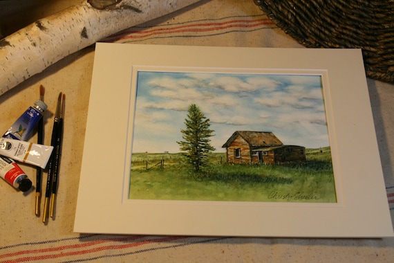
In the meantime, here's a teaser on what I'm putting together for a post in the near future.  My sister is very curious about the magic eraser method I mentioned on Facebook.  I'm just learning how this can be effective so don't mean to sound like a pro here.  It's an experiment that I tried on a painting recently.


So for now, I'm heading back to get going on paintings for the remainder of my morning.  That river's not going to paint itself!  If there's a technique you'd heard about but never tried...let me know, maybe it could turn into another blog post.  Maybe creative little videos will be added eventually.


Until next time,

-Christy

because she must make art.