Showing posts with label summer. Show all posts

Thursday, August 11, 2016

A note from the artist.

It's Thursday.  What's Up?

Well, life is interrupting my artistic schedule for a while.  That's just how it goes sometimes.  Our home has been full of activity, projects, Olympics and other random-spur-of-the-moment things.  I'm so ready to get back to the cherry blossom paintings!  My art room has been the focus of some renovations that will make creating here a more happy experience.  I'm working on some great opportunities for presenting my artwork at a local fair.  It's going to be a busy 4-5 weeks along with preparing my daughter and son for back-to-school at the same time.


There's plenty of artwork-related rambling and photo sharing here, so go explore a little bit!  You might find a post you'll enjoy while I try to catch up behind the scenes.


Thanks for dropping by and come again often!  I'll have more stories, tips, and artwork progressions to bring to you.  Watercolor paintings are coming along nicely and it's difficult to set them aside but that's the way life is right now!  The summer is drawing to a close soon so I'm taking time to be with my family and enjoy some downtime.  I'll be back with an update in two weeks!

-Christy
She must make art.


Thursday, April 21, 2016

Palettes at Every Turn


With the arrival of spring, I'm thinking ahead to summer.  Summer in Montana and weekends in the mountains mean packing an art supply bag.  For so many years, I've been faithful to pack the supplies and hauled them with me as we traveled.  I've not spent very much time using them.  We are so busy, not taking much time to stay in any one spot for long.  There were times I made an attempt to paint for that brief 15-20 minutes.  Then it's time to pack it all up and get on with another activity.  Those camping trips were full of activity with young kiddos.  We took them hiking at 4 and 5 years old, their hooded jackets tied at their waists and a little water bottle of their own.  They loved it from the very start.  We'd stop to dip our toes in the lake or stream, such icy cold water.


Several cameras have been taken along to record it all.  I've been watching for the art reference photos and the priceless family memories at the same time.  Now, they're teens and needing to take their own photos.  Whether it's on a cell phone, tablet, iPod, or an actual camera...we are all taking our share of photos.

My fingers are itching to start packing it all up again!


Last summer's art supply bag and gear.

Here a palette, there a palette, everywhere a palette!


One of the key items I'll pack in the art supply bag is a watercolor paint palette.  I was thinking about purchasing yet another new palette for travel when I realized I have plenty of palettes.  Digging through cupboards, I gathered them all up.  I chose three to clean up, removing old dried paint, and they are like new again!  I found my travel palettes and am considering using them this year.  They are stocked with plenty of watercolor pigment.  One needs to have the mixing area cleaned.   For some reason that I cannot describe, I am not comfortable using them.  Maybe it's just because I haven't had a lot of time using watercolors while we are away from home.  It's an awkward, unfamiliar experience.  I always long for my big palette.

Travel Palettes


The Rembrandt travel palette is a mix of luxury and space-saver.  It's petite paint pans and travel paintbrush are tucked in a sturdy case.  The navy blue velvet bag just tops it off!  I've used it a bit as you can see.  This was a pricey little bundle, purchased before children...  I'm looking forward to having the time to break it in soon.


The metal travel pan came empty and I filled it with the pigments years ago.  It has a thumb hole and is easy to position on my forearm.  In the past, I have not painted while standing but it would be a great habit to start.  I'm not sure I'd still choose the same pigments.  I've got a better understanding of pigments now.  When I filled this, I selected pigments on a whim.  Adventurous and spontaneous, I didn't conform to the all the standards recommended.  There are several in the metal palette I might not select this time around.


The plastic palette was another attempt to find a way to be comfortable painting in nature.  It's got more room for pigments than the Rembrandt and takes up less space than the metal case.  This one has a thumb hole.  It also has smaller holes to hold paintbrushes.  Here again, I'm not so confident about my pigment choices but I think it would be a fun challenge to make them work!


Studio Palettes


So, take a look at my usual "Old Faithful" palette.  It is the oldest one I own and has been well used and abused.  It's had cracks repaired with hot-glue seams.  It mixing area is still a mess!  All those areas of mixed pigment...instrumental in completing many paintings!


Now here's a look at the one that replaced it and you'll see a lot of similarity.  This style of palette is my go-to standard routine for painting with watercolors.  With large wells, plenty of pigment means less interruptions with making refills.  The center mixing areas are roomy and the lid doubles as another mixing area.  Labels for the pigment wells make the mixing easier.  Whether labeled with a permanent marker or a label maker, it's worth the time.


Yet More Palettes

Some palettes I use for more pigment that won't fit on my main palette.  You're probably thinking this just sounds crazy.  It's really not that crazy at all!  There are core pigments needed for the best mixing results.  There are other pigments that aren't needed very often.  They are needed in select paintings, depending on the color scheme.  The pigment names are written on with a fine-point Sharpie marker.  When it's time to clean off the writing, a magic eraser does the trick!


In the past several months, I've changed my method for single pigments that are used less often.  Small plastic cups with lids are perfect for keeping pigment.  The name of the pigment is written on the lid with permanent marker.  My work table is crowded enough most of the time.  These little cups save me from needing to make room for another palette.


The other three palettes are clean and white!  The enamel butcher's tray has a lid.  It works best for mixing up a large puddle of watercolor pigment.  The two plastic trays have plenty of areas for mixing while keeping mixed pigments separate.  I think taking one of them for travel would be perfect; the mixing areas in the travel palette is extremely limited.


I may not have convinced you it's necessary to have this number of watercolor palettes.  Or have I?  Aren't they wonderful?  Just to me?  Aren't you at least a little tempted to purchase yourself a travel watercolor kit?  They are such a treat!  I'm sure there must be some way to pack a small bag of art supplies.  I haven't been able to manage a small bag in a long time.  How do I choose what to leave behind?  I'll compile a basic list of items to take for art in nature and share in the next few weeks.

If for some crazy reason, you're been searching for a watercolor palette like one of these... just ask me for more information.  It's been a long day so I'm not going to be super descriptive with specific brands and links.  You want any of that, just comment and I'm glad to help!

Thanks for letting me show & tell today with the palettes...
let me know what you're curious about related to watercolor art!

-Christy

she must make art.


Thursday, November 12, 2015

Montana's Big Sky Farmland: Watercolor Painting No. 2

Watercolor Landscape of Big Sky Farmlands No. 2


Dramatic clouds across a blue sky are the inspiration for the watercolor landscape I'm sharing today.  Last week, I shared the first painting Big Sky Farmlands No. 1 where I showed the progression of that painting.  The fantastic effects of sky play against the wide spreading fields.  This is the photo that I sketch from to begin this process.


 I sketch on tracing paper so that the watercolor paper is not marred up with multiple pencil lines and eraser marks.  The mistakes are corrected on tracing paper.  I use a piece of acetate with a white 4 x 4 grid; it's taped to the front of the tablet screen.  A grid of 4 x 4 squares is drawn onto a sheet of tracing paper.  The grid on tracing paper is laid as the second layer below my sketch.  The bottom layer is a piece of white card stock which makes it all bright white in appearance.


As I sketch, I use more shading than will appear on the watercolor paper.  This sketch is my guide, giving direction in values for the final work.  I'm able to work out my design for the main parts of the composition here.

Thursday, October 15, 2015

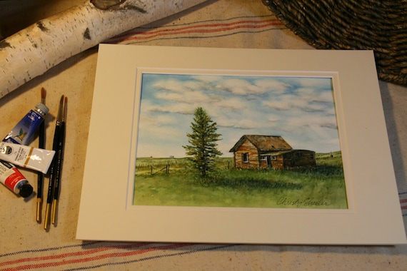
Weathered Old Place and Lone Pine Watercolor Painting


Capturing a Favorite View with Watercolor Paint


A familiar view to those who know the area well, I think of this as the lone pine painting.  I know that doesn't give much attention to the old building that is it's companion.  Admittedly, I do not know the history of this place.  What's its story?  I just know that it grabs my eye every time I reach the top of that hill at the top of the bench.  This roadside view is one that I have always enjoyed seeing.  My photos are quite old now.  With only a few printed photographs, they weren't on my computer's hard drive.  I scanned them so I would be able to pull them up on my tablet through the Picasa Tool.  I'm not going to explain it any further because the tech part is confusing every time.  I've been spending a lot more time on the computer since committing to art on a daily basis.  At times, I can feel frustrated because so many computer related tasks need to be done instead of picking up a brush.

The original sketch was done on tracing paper.  The photo shows the support board holding from top layer to bottom, reference photo, tracing paper, white cardstock (makes sketch stand out better), and graphite paper.  The graphite paper was made with a sheet of tracing paper, soft graphite pencils, and rubbing alcohol on a cotton ball.


The sketch is transferred to 300 lb. Arches cold press watercolor paper.  This watercolor paper is thicker with a medium tooth surface.  It can take wetter washes with very little buckling or bending.  I'm able to use more techniques without the paper breaking up as can happen with thinner papers.  The tracing paper sketch is layered over graphite paper and watercolor paper.  My fingers have the foam board strip as a resting place; this prevents unwanted smudges and lines being transferred to the watercolor paper.  During this step, I frequently (and carefully) check to be sure the drawing is really transferring so lines are dark enough on the watercolor paper.  Any shifting of top or bottom layer is a BIG uh oh.  I use a pencil with a harder lead, like a 2H, to make the transfer work better.


Checking the drawing that's been transferred to watercolor paper, I check for lines that need more defining.  There are plenty of soft smudges from the transfer paper.  After erasing away the smudges and unwanted lines, I use a brush to sweep away the eraser bits.


It's almost time to paint!  Pulling out a reference book, The Watercolor Painter's Palette I'll plan out key color mixes that match my vision most closely.  This book is one I refer to often because it shows what the color mixes will look like.  There are several pigments I own and use that are not shown in this book.  It's just handy and helps guide me in the right direction.  I usually narrow down my colors to a main red, blue, and yellow...gearing toward those that are more transparent and less staining.


I also refer to my stash of color mixing grids.  The mixing grid from the crocus paintings has some very nice greens.  The blog post, Painting the Crocus from July shows this grid with my reference set up.  It's still a great resource tool and worth the time it took to create it.  I'm much better at planning out my color mixing than other prep practices.  I know I ought to make value studies part of my planning process.  All these disciplines make the art better.


This is the color mixing grid I made before beginning the five landscapes, this painting included.  It's much simpler and and focused on key colors I wanted to achieve.


The drawing is ready on watercolor paper for the first strokes of color.  I've got the tracing paper sketches (I made an additional sketch for the tree) and reference photos close at hand.  If you look closely, you'll notice a white grid on the screen of the tablet.  The white lines are drawn onto a piece of acetate.  The acetate is taped to the tablet screen.  I'm going to to tell about this tool in a future post.  I am studying all my photos to pick those that best illustrate what I do with it and what it's for...it's most useful while drawing the initial sketch.


 I wasn't enthralled with my first efforts with this sky.  My frustration with the results increased and I nearly gave it up to begin again fresh.  My husband backed me up, agreeing that if I was that unhappy with it, start again.  I'm not sure why but I fought the urge to scrap the whole thing.  Feeling like I had nothing to lose, I did something a little gutsy.  I did a little reading online and then grabbed a magic eraser.  In the past, I'd been cautious enough that I wouldn't risk it on other paintings.  Why mess up what's already going well?  In my previous post, "Watercolor Landscape & Sky: Scotch Tape and Magic Eraser" I explain how I used the magic eraser to correct the clouds in this painting.  I am sorry there is no photo of the before, only the after.  It's the mistakes we usually don't want to remember, so no thought to grab the camera.  Next time perhaps.  I keep learning every day!

Once the first washes of green were laid in to the prairie portions, I was excitedly watching as it all came together.  With careful thought, I studied the textures of the weathered wood on the building.  I planned the layering of the color from beginning to last, base to top.  This photo is not as clear but still shows the progress in elements being developed.  The tree has masking fluid protecting its detail for later.


Now the masking fluid has been removed to show the white of the paper in the tree's form and taller grasses.  My evening critique (with husband's input) brought focus to the shadows being exceptionally dark.  I'm learning to wet then scrape back with a palette knife for more definition.  Wetting and scrubbing also brings back the light details in specifically chosen areas.


A view from above shows the layout of an organized work space.  Lately, this has been more disheveled and chaotic as I work on three at a time.  I'm fighting the nagging feeling that cleaning needs to be done.  The priority needs to be finished paintings and a few quick clean up sessions can come later.  Breathe.  Just breathe and focus.  Continue to press on.


This art piece has taken me on a journey of persistence.  It's been an incredible experience to begin and finish eleven paintings since June.  I'm celebrating sixteen weeks of dedicated focus on my artistic goals!  At the beginning of my self-given challenge, I had felt lost without purpose for this creative energy.  I didn't schedule my days with art being a priority.  I didn't know how it could be possible.  With great curiosity, I searched to find artists that could be creative daily and raise a family.  I wanted to have it all spelled out, like "The Dummies Guide to Being An Artist, Wife and Mom."  Nope.  It's not in print.  Without finding a definite "here's how it's done" plan, I am discovering it as I go along.  We are communicating within our family to find out what we all need.  I am letting the house be less than perfectly put together.  The laundry, ironing, and cooking are not always done like I would prefer them.  If I don't relax my expectations, I'll have to give up the creative pursuit again.  If you stop by and see a cluttered home, it's because I've been painting today.


This painting is now available on Etsy at ChristySheelerArtist.
If you have not been to my Etsy shop, I invite you to go see the selection available there.


Copyright 2015 Christy Sheeler.  All Rights Reserved.


It will also be matted and framed to hang in a local restaurant.  I'll share more when that step has taken place.

On Facebook, Google+, and Instagram, I share more frequent snapshot views of progress through out the week.  You can find those listed on my Contact Page.

So that's my bit to share for the week.  I'm excited to be able to describe the work going on with my palette and brushes.  Next week, I'll give a beginning to end progression of another painting.  If you're familiar with the Rock City natural formations, you'll want to stop back.  I've chosen a view from the river's edge viewing the rock cliffs and hills above.

Until next time,

-Christy


because she must make art.


Tuesday, September 22, 2015

Fresh Cherries Watercolor Painting on Etsy


These fresh, juicy cherries are a new addition to my Etsy shop ChristySheelerArtist today.
My neighbor has several fruit trees and this is one of them.  While we visit in the yard, she takes me around on a tour of her plants and trees.  We talk all the details of when they were planted and how much they've grown since last year.  Some plants and trees come from local nurseries, but many come from family members and friends.  She takes the dogs (ours included) out into the country to run and sometimes she digs up plants on those days.

It doesn't surprise my neighbors to see me out with my camera on a regular basis.  I observe the lilacs and coerce my husband to get the ladder out to see the tallest sunflowers.  I think it must be a complement that someone else admires what's growing enough to be excitedly snapping photographs.  I hope it is, but if not, I'm grateful they tolerate me and my obsession for more great photo references.

After reviewing the many photos I took that fall, this one just seemed to beg for the paintbrush.  This watercolor painting is my way of describing the way the cherries hang from the branch on delicate stems.  I enjoyed mixing the colors of paint for textures on the branch and the leaves reaching out to be seen.  The light and shadow are contrasted to make it all pop off the paper.  There are blues and violets in the shadow areas.  I used some controlled scrubbing to accent the highlights on the cherries.  The background is loose and soft.

This painting would be a lovely accent or focal point to display in a kitchen or dining room.  I package it with an ivory double mat and cellophane sleeve.  It would easily be placed in a purchased frame and a black or brown frame would set it off nicely.

My regular weekly post will be added on Thursday,
so stop back and see me again!


-Christy


Because she must make art.

Thursday, September 17, 2015

Nature's Water Therapy


Have you ever needed to get away for few days?

At the end of July, our two teens were gone for a week.  We had a weekend to get away by ourselves.  We went camping.  I know, you're saying, "really, again?"  It's what summer in Montana is made for...there's no other way to explain it.  The beautiful blue skies and the landscape is just too irresistible.  We packed up the basics we would need and headed for the mountains.  It's under an hour's drive and we have our little home-away-from-home parked and settled.  We had a great time sharing one another's undivided attention.  There wasn't a set schedule and we ate when we were hungry.  It was so freeing to not be thinking about a regular mealtime schedule.  We ate our favorite junk food.  We didn't have to be a good example of healthy eating!  It was a nice vacation from the typical camping trip for our family of four.  We missed our kids while they were gone for that ten days but the break relaxed us a great amount.  The weather that weekend brought high temperatures and I noticed that many flowers were done blooming.  The vegetation was changing, preparing for late summer turning to become autumn.  There were signs that the local area was dry, which would in turn result in a great number of wildfires.  

While we were out taking the dog for a walk, I had my camera but it late morning which meant the sun was high.  The lighting was not best for photography.  Everything had a tendency to be washed out and had less contrast.  The longer shadows of morning and evening really add to composition.  I ought to make myself get out earlier and sacrifice sleep for my art.  I wished that I'd been out early in the morning but sleeping in late was such a welcome option.  I didn't really view this weekend outing the same as others.  I had been pushing so hard at home in the studio and felt the need for some time off.  My main focus was on enjoying a relaxing time with my husband.  Photography for art references wasn't the main goal that it had been on previous camping trips.  


This area runs along the road and is a series of beaver dams.  The colors were a little washed out, especially in the sky but I used a few Picasa filters for improvement.  When I have a photo I'm not

Thursday, September 10, 2015

Summer's Brief Beauties in the Garden


September is here and soon we will kiss summer goodbye again.  It's Wednesday afternoon and I am so wiped out from a morning at the dentist...but I can't bear to see a week go by without a new post here.  I had figured to push hard and spend the afternoon getting caught up on work in the studio.  After two and a half hours in the chair, coming home with a numb mouth...thoughts of potato soup were in my head.  So thankful for my dear husband and his potato soup today.  He made it on our rainy Labor Day weekend.  I spent several hours comfy with a good book and a warm lap blanket.  Next, I just felt an urge for a nap and didn't fight it.  A wonderful time of quiet, hoping that Lucy, my feline assistant was behaving herself but not caring enough to not fall off to sleep. (Insert photo of hot potato soup and good book here.)  I have been so pleased with my ongoing weekly posts, with no lapses in holding to this challenge I've given myself.  It would be sad to let it go so whatever this post becomes by the end, I didn't give up.  Hang in there with me and we'll see how this goes.

Thursday, September 3, 2015

Mount Oberlin, a Waterfall, and a Sketch


It's time to be realistic here.  
I feel like I chickened out...in more than one way.  


Have you ever felt that way?  Gosh, that's how I have been feeling and I'm needing to re-train my brain.


I've had the best experience over these summer months.

It felt completely different than before, like I could make some real progress.  Sometime during the second week of August, the Indian Paintbrush paintings were complete.  Those three paintings brought my summer total to nine paintings in less than three months.  It wasn't easy but nothing worth doing ever is, right?  The time had come to clean up and start again.

The great amount of progress I had made during the summer months must have gone to my head.  Or the heat or both?

I say this because I was really feeling ambitious.  Maybe too ambitious?  Okay, my point is this...there's this breath taking view in Glacier National Park that I have wanted to paint for many years.  Each time we drive over the road, known as Going To The Sun, which leads to Logan Pass Visitor's Center, it draws me to take it in the great expanses and massive peaks.  From what I can gather, I believe the peak in this favorite view is Mount Oberlin.  Correct me in the comments if I'm wrong, please.


Off to the right is a small parking area with boardwalk and the mountain goats often graze here.  There are very few parking areas on the Going To The Sun Road and during the peak season, it's really hard to score a parking space.  I took these photos quite a few years ago and it's been on my list of someday paintings.  If it was possible,


I would park myself at the base of this waterfall 
and just soak it up for the whole day.  


Thursday, August 27, 2015

Tea, Hollyhocks, and Kittens


I'm a little quirky...it sounds so much better than weird.  

So maybe today's rambling will make you feel a little more normal.  My topic for today is to share a few things about me that most people wouldn't know.  I've loved tea for many years now but just recently began enjoying iced green tea.  When I'm in my usual routine, I'm drinking a smoothie in the late morning.  After lunch, I often switch to iced green tea.  Sometimes I add a little stevia to give it a bit of sweetness.  It took me a while to develop a taste for green tea.  It's got so many health benefits that I didn't give up and now I enjoy it.  Did you know there's flavored green tea?


In Great Falls, Montana there's a little shop on Central Ave.  In Cahoots For Tea (the shop's name)  sells loose tea and all the tea accessories you could wish for.  You can buy the teas by the ounce and the flavors are wonderful.  It's just a great little splurge to pick up a few ounces of a favorite like Picasso Blue or a new one like White Raspberry Champagne.  The green teas I have enjoyed most are peach and pomegranate.  I transfer the tea leaves from the little zip top bag to glass jars.  I store the jars in a cupboard away from light and heat.  It's easy to remove the label from the plastic bag and place it on the jar.  The little metal infuser holds quite a bit of tea but only a teaspoon makes quite a bit of tea.  When I make my tea, it's super concentrated so I just need to add a little to the top of a glass of iced water.  So the concentrated tea is kept in a glass jar in the fridge.  It takes up less space, no need for a full pitcher.  It's quick and easy to add to a glass without all the prep every time.


My other favorite drink this summer has been iced water with mint leaves and a squirt of lemon juice.  The fruit and herb infused waters are popular now as an alternative to carbonated soda.  Just one or two mint leaves, given a gentle twist, give the water fresh mint flavor.  If you decide to add mint to your garden, note that it spreads like a weed!  I'm going to need to plan how to bring some live herbs in over the winter.  Fresh herbs are worth it!  So for a spin on drinking more water, try lemon (or lime) and mint!  I've also tried cucumber slices and that's surprisingly delish, too.  These combinations are easy to do and I feel so much better without soda.  While I'm working on drawings or paintings, it's too easy to pull out the snacks and candy...I've got quite a sweet tooth.  Sometimes I forget to drink my water and keeping these drinks close at hand helps so much.  


Changing topics... I've got to get this out there...

I stalk other people's flowers.  


There.  I said it.  I feel a little creepy about it and hope other people don't bat an eye BUT I think I'd be suspicious of someone walking around the neighborhood with a camera like I do.  (Click on Continue Reading below left...)

Thursday, August 20, 2015

Indian Paintbrush


The stately Indian Paintbrush are bold and hardy.  The shade of hue can vary from pinks and peaches to fiery red.  They make their home in a wide range of places.  Along the unpaved roads in mountainous areas, they take their share of dust from passing vehicles.  They are found in clusters next to the trails and they seem to love the full sun.  Mountain meadows have these beauties scattered in the lush green like confetti.  I realize not everyone can be so mesmerized by wildflowers...after all, aren't they just weeds?  I still feel like this creation is so awe-inspiring when we stop long enough to take it all in.  We see intricate details we would never realize otherwise.  

I learn something new every time I take on painting a wildflower.  I have painted these little gems before...over ten years ago.  There's usually a part of the composition that will stump me.  Sometimes I am aware of it before I begin; I just think on that challenge as I work my way toward it.  One thing I learned this time is that there are more than one species of this flower.  These three photos show one of them.  Are you wondering how I figured this out and why it really matters?  I am not a botanist or any other type of expert on the subject.  In order to be able to accurately describe what I am presenting as my work, it seems important to be ready to answer basic questions.  One basic question is, "what kind of flower is that?"  I use printed photos and a Motorola Xoom (love its big screen!) to study my reference photos.  The tablet makes it possible to zoom (ha!) in on details so much more closely.  It's just amazing that printed photos are not so necessary anymore.  


I began the sketches in early summer.  The drawings were made directly on tracing paper.  I believe I was working on the crocus drawings at the same time so I set aside the paintbrush flower sketches.  I remember feeling like I was a little glazed over mentally when I finished the stack of sketches.  I was tired and didn't feel very confident that these sketches were complete.  It's hard to say until I actually have paint ready to apply to paper.

I was pushing myself pretty hard not only with art work but in all areas.  I had taken on several other projects and feeling a little over committed.  My dear man has been such a fantastic support and encouragement.  He has gently reminded me when he senses I need to relax.  With the thought of these lofty goals I've made for myself and no real road map on how to accomplish them, it all feels complicated and disorganized.  At this point my goal was three painting in a week and half.  That was only possible under ideal circumstances...so I will have to take it easy on myself and my family when it can't happen that way.
 Once the crocus paintings were completely finished and I'd taken care of everything necessary to have photos in the computer...
I began the process again!


My computer file has a total of 156 reference photos for the Indian Paintbrush at this time.  We are going camping this weekend so that number could grow yet before summer's end.  I chose the three photos for these paintings; Two sketches came from photos on the tablet and the other sketch was a combination of two photos that were only available as printed copies.  Those two photos I did eventually scan in so I have digital copy of them now.  I keep finding myself fighting the urge to panic when I can't locate the reference photo on the tablet right away.  It just takes a little more patience and remembering to relax more.  There is a bit of advice I need to take to apply to my whole entire day.  Can you relate?


I must add that at this season of my life, my kids are now teens.  They don't need me like they used to in their younger years.  Oh, and it was adorably cute but mildly frustrating.  I remember four or five years ago, I had come out to get settled at my art table...so quietly hoping no one would notice where I was.  Everyone was home and busy so I wanted to take some time for myself.


My art room is also the pass through at the back of the house.  To get to the backyard or garage, the quickest route is through the art room/solarium.  It didn't take long for one of my kiddos to come into the room, and observe saying, "oh, mom's painting...I want to paint, too!"  I have never told my children no to joining me.  It may not be what I had in mind but they are welcome, too.  We began unfolding card tables and bringing out their art supplies...and soon one was near me trying to find a ruler.  Then another looking for watercolor pencils.  I was consciously working to keep my patience.  I asked myself how we could make this work for all of us.  It meant my goals had to be adjusted and remember that life would not always be like this.


Frustrated at times?  Oh, and how.  Those times were not forever...very temporary.  This summer has been a huge adjustment for my teens because they need to be more independent.  They need to understand we are working into a new framework of me making a creative career.  Change is never fun.  We've had many little talks and I try to explain how this is the same as yet different than if I had a job outside of the home.  I just cannot resist.  You've got to see this throwback to another time.  I am sharing a photo of our little art project when they were still so young.  Six years ago and time just flies!  They are cuties, I know...but I remember being so tired and wondering where they got all that energy.  Isn't it nap time yet?


Okay, thank you for letting me head off track for a little bit.  So I have my sketch and graphite paper.  I have been using 300 lb. cold pressed Arches and loving it because it buckles much less and it can take the scrubbing to lift out color.  The layers are board support, watercolor paper, graphite paper and tracing paper sketch on top.  It's very important that the sketch stays in place or the process gets more challenging.  I had one sketch move a little in the process and half of the transfer was also off.


Here's the slightly zoomed out view of what's going on at my table.  Reference photos, paint is mixed in the little cups, spray bottle is at the ready...


And here's the reality of it all!  (See below.)  This is a broader view of the work space at this point.  I have more setting up to do because the foam board tent is where I post my color mixing guide.  My glass of iced tea is cold and easily reachable.  There are the books I've been reading; the Wild West series by Lauraine Snelling.  I just love historical fiction.  I know I'd be over the hard work of that life in a heartbeat but I soak it up anyway.  Maybe it makes my life feel easier?  Not sure.  So while it could be much messier, this is typical for how I work.  When it gets to be too much, I break to clean for twenty minutes.


In the photo below, you can see the color mixing guide is up on the foam board.  This was made by choosing the pinks/reds that I might use.  Then I mix each one with a different yellow or blue to visualize what mixes are possible.  This is my quick reference and there's usually one for each set of paintings.  I keep them and refer to them even when working on other paintings.  So much time can be lost with guessing in color mixing while never really hitting on a mix that works.  I pick out of this grid the key mixes that I like most.  The pigments are mixed up in little cups with lids.  I record the pigments on the lid with a fine permanent marker.  


Here is the color mixing guide I used for these paintings.  The red/pink pigments used are down the left, followed by two blue pigments.  The yellow/gold/brown pigments across the top were each mixed with a pigment down the left side.  Alizarin crimson + lemon yellow = color in the box beside the two.  Alizarin crimson + aureolin = the color first row below aureolin.    If I've completely lost you, I am sorry...  It seems that when others are not familiar with this concept, it takes them a bit to work through it mentally and then light bulb!  The facial expression expresses understanding!


I began working on the backgrounds on pretty damp paper.  I wet down the paper in an area of about 3-4 square inches with a larger brush.  I can work between round and flat brushes for this step.  My pigment on the palette is wet and soft.  This means I can work quickly without many speed bumps.   For the backgrounds I chose several mixes and softly laid them in so they could mix on the paper.  The background on the left shows a little of the effects salt on shiny wet paper makes while it dries.  The background at center has little or no extra effects.  The background at right has a much more dramatic effect from both salt and blooms.  Blooms are an effect that occurs when water or wet paint flows back into an area that is more dry.  Usually a bloom is unwanted and viewed as a mistake but I really like them in backgrounds.  These effects show the qualities of watercolor that are unique to this art medium.  They are quite enjoyable to look at and draw positive attention.  I know this is a little small and doesn't give much opportunity to see the detail.  Just hang on...and try not to scroll to the end.  It will be worth the wait.


As work began on the flower petals of the one in the center, I slowly began to realize the differences between it and the other two.  The petals and leaves are different in several ways.  The form of the petals is more rounded and not spiked.  The colors are more toward reds and yellows.  The leaves are more complicated in shape.  The painting process of this flower just flowed so smoothly and effortlessly at times.  There was very little about it that I struggled with from beginning to end.  I felt immersed in the creative process.  I did not switch from one painting to another this time around.  I worked solely on this one until it was done.  


There is a lot of mixing going on at this point and I'm sure it appears to be mind-boggling confusing.  Bear in mind, I have not always worked like this.  The large palette has room for more pigment from the tubes and doesn't have to be refilled so often.  The smaller palette has pigments I use less often and it changes more often.  I spray down both palettes routinely to keep the paint wet enough that the brush never has to scrub out pigment.  With these paintings, it helped to make notes in a steno pad to keep track of what I used and where.  The base color of the leaves, the base of the petals, the stem and so on...I see in my notes that "WOW greenish gray" was made with lemon yellow + cerulean blue + indigo blue + olive green.  Funny how my mind was thinking at the time.


Below there's a shot of the base color going in with yellows and greens.  The reason for this?  The layers yet to come are going to mix ON the paper.  These base layers will be dry when the next layer is painted in but the yellows and greens will tint them.  It really works that way.  The next three photos show the way this painting changed as more areas were worked and built.


The lemon yellow and gamboge and hansa yellow are the base of the petals.  There's a glow given by them being the foundation.  You can just feel the sun warming the petals!  The mixes used the give the petals the vibrant reds; the placement of the deeper hues give them shape.  At this point, I was bringing in darker red mixes but I was beginning to think I needed a glaze of blue or violet in the shadow areas of the red petals.  I was very nervous about this step.  The deep reds were not achieving the effect I was after.  A little dioxanine violet worked great and I was so relieved!  If you study the differences in the darks of the petals between the two following photos, you should be able to see the changes.  It is subtle but necessary to create shadowed areas.


The buds nearest the leaves turned out to look like crepe paper.  They are preparing to unfold and become full of more red petals.  The light source is from the upper right so I work to keep the shadows consistent through out the piece.  


The view of another painting in progress.  The background is more easily seen here.


I somehow neglected to take a mid-process photo of the other one.  Here are the three completed paintings; you can see they have their own unique identity for colors, background, composition and effect.  Without any planning to do so, they each become different in a pleasant way.


This one I titled Indian Paintbrush Delight because the process was so smooth and flowed in an enjoyable way.  It is 8"x 10" on 300 lb. cold pressed Arches.


Indian Paintbrush with Branches, 8" x 10" on 300 lb. cold pressed Arches.  The petals were much more pink with yellows and greens on a few tips that end with curls.  I had lightly sketched in grasses and twigs that were in the photo.  When watercolor is painted over pencil, the pencil lines are nearly impossible to erase so I had to follow through and it did turn out well.


Indian Paintbrush Group of Three, 8" x 10" on 300 lb. cold pressed Arches.  This is the most common appearance of the paintbrush flower.  This one is the favorite from my family's votes.  Mine is the first, as if you couldn't guess.  The effects of salt are unpredictable, depending on paper wetness and pigments used...and even perhaps the dry, warm air speeding up the drying time.


Reflections on My Summer:


On June 25th of this year, I wrote my post, Big New Adventures of Artist Momma.  In it, I described this new challenge I'm giving myself...with the support of my great guy and sometimes my kids.  The blog is slowly evolving into my journal of blending art into a daily habit.  A creative career is the long term goal.  We've talked through the steps and stages with goals along the way.  Etsy is one of them.  If you are intrigued or excited to follow this adventure, use the contact form and I'll send you an email invite to the grand opening of the online shop!  


I'm fed by the creativity in ways that my soul really needs.  I know my kids don't really understand it now.  Someday they will see how important it is and maybe they will be inspired to go after their own soul-driven outlets.  Today I will celebrate week ten!  This is a huge accomplishment.  To not only create this much art in this amount of time but also write about it on a weekly basis is such a huge step for me.  The past two weeks have not been so productive with completed paintings.  I'm feeling the ebb and flow of family schedules.  The kids were gone to my parents' in Austin, TX for ten days and I finished these three paintings during their absence.  It's one week until school begins again and I'll miss the kids being at home.  At the same time, I look forward to having quiet days here at home.  Today has been a day of interruptions, too many to count and I just keep redirecting my steps to the art studio.  


My dear man has helped me in many ways but the one I most appreciate right now... a computer for my use in the art studio.  We've cleaned and rearranged my space to make it function better.  I've got a new work table for card making (covered in my previous post) but I'll share more about that later.  I'm still working on my business card, not quite decided on what it should be yet.  


This week is really crazy with what we've got scheduled and I hate that I'm so limited on my hours in the studio.  I've just got to roll with it!  That's all there is to it.  I've got to be flexible and know that it's all going to come together in time.  Summer won't be here much longer.  Soon it will be keeping up with the football schedule and autumn will be the season to relish.  

So until next Thursday...watch for the moments of everyday that are snapshot beautiful, the stuff of Instagram that we can take as a special gift through the hard stuff.

-Christy