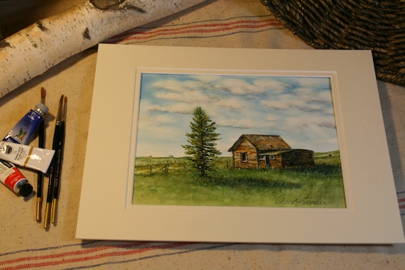
Capturing a Favorite View with Watercolor Paint
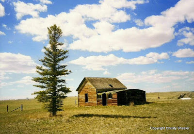
A familiar view to those who know the area well, I think of this as the lone pine painting. I know that doesn't give much attention to the old building that is it's companion. Admittedly, I do not know the history of this place. What's its story? I just know that it grabs my eye every time I reach the top of that hill at the top of the bench. This roadside view is one that I have always enjoyed seeing. My photos are quite old now. With only a few printed photographs, they weren't on my computer's hard drive. I scanned them so I would be able to pull them up on my tablet through the Picasa Tool. I'm not going to explain it any further because the tech part is confusing every time. I've been spending a lot more time on the computer since committing to art on a daily basis. At times, I can feel frustrated because so many computer related tasks need to be done instead of picking up a brush.
The original sketch was done on tracing paper. The photo shows the support board holding from top layer to bottom, reference photo, tracing paper, white cardstock (makes sketch stand out better), and graphite paper. The graphite paper was made with a sheet of tracing paper, soft graphite pencils, and rubbing alcohol on a cotton ball.

The sketch is transferred to 300 lb. Arches cold press watercolor paper. This watercolor paper is thicker with a medium tooth surface. It can take wetter washes with very little buckling or bending. I'm able to use more techniques without the paper breaking up as can happen with thinner papers. The tracing paper sketch is layered over graphite paper and watercolor paper. My fingers have the foam board strip as a resting place; this prevents unwanted smudges and lines being transferred to the watercolor paper. During this step, I frequently (and carefully) check to be sure the drawing is really transferring so lines are dark enough on the watercolor paper. Any shifting of top or bottom layer is a BIG uh oh. I use a pencil with a harder lead, like a 2H, to make the transfer work better.

Checking the drawing that's been transferred to watercolor paper, I check for lines that need more defining. There are plenty of soft smudges from the transfer paper. After erasing away the smudges and unwanted lines, I use a brush to sweep away the eraser bits.
It's almost time to paint! Pulling out a reference book,
The Watercolor Painter's Palette I'll plan out key color mixes that match my vision most closely. This book is one I refer to often because it shows what the color mixes will look like. There are several pigments I own and use that are not shown in this book. It's just handy and helps guide me in the right direction. I usually narrow down my colors to a main red, blue, and yellow...gearing toward those that are more transparent and less staining.
I also refer to my stash of color mixing grids. The mixing grid from the crocus paintings has some very nice greens. The blog post,
Painting the Crocus from July shows this grid with my reference set up. It's still a great resource tool and worth the time it took to create it. I'm much better at planning out my color mixing than other prep practices. I know I ought to make value studies part of my planning process. All these disciplines make the art better.
This is the color mixing grid I made before beginning the five landscapes, this painting included. It's much simpler and and focused on key colors I wanted to achieve.
The drawing is ready on watercolor paper for the first strokes of color. I've got the tracing paper sketches (I made an additional sketch for the tree) and reference photos close at hand. If you look closely, you'll notice a white grid on the screen of the tablet. The white lines are drawn onto a piece of acetate. The acetate is taped to the tablet screen. I'm going to to tell about this tool in a future post. I am studying all my photos to pick those that best illustrate what I do with it and what it's for...it's most useful while drawing the initial sketch.

I wasn't enthralled with my first efforts with this sky. My frustration with the results increased and I nearly gave it up to begin again fresh. My husband backed me up, agreeing that if I was that unhappy with it, start again. I'm not sure why but I fought the urge to scrap the whole thing. Feeling like I had nothing to lose, I did something a little gutsy. I did a little reading online and then grabbed a magic eraser. In the past, I'd been cautious enough that I wouldn't risk it on other paintings. Why mess up what's already going well? In my previous post, "
Watercolor Landscape & Sky: Scotch Tape and Magic Eraser" I explain how I used the magic eraser to correct the clouds in this painting. I am sorry there is no photo of the before, only the after. It's the mistakes we usually don't want to remember, so no thought to grab the camera. Next time perhaps. I keep learning every day!
Once the first washes of green were laid in to the prairie portions, I was excitedly watching as it all came together. With careful thought, I studied the textures of the weathered wood on the building. I planned the layering of the color from beginning to last, base to top. This photo is not as clear but still shows the progress in elements being developed. The tree has masking fluid protecting its detail for later.
Now the masking fluid has been removed to show the white of the paper in the tree's form and taller grasses. My evening critique (with husband's input) brought focus to the shadows being exceptionally dark. I'm learning to wet then scrape back with a palette knife for more definition. Wetting and scrubbing also brings back the light details in specifically chosen areas.
A view from above shows the layout of an organized work space. Lately, this has been more disheveled and chaotic as I work on three at a time. I'm fighting the nagging feeling that cleaning needs to be done. The priority needs to be finished paintings and a few quick clean up sessions can come later. Breathe. Just breathe and focus. Continue to press on.

This art piece has taken me on a journey of persistence. It's been an incredible experience to begin and finish eleven paintings since June. I'm celebrating sixteen weeks of dedicated focus on my artistic goals! At the beginning of my self-given challenge, I had felt lost without purpose for this creative energy. I didn't schedule my days with art being a priority. I didn't know how it could be possible. With great curiosity, I searched to find artists that could be creative daily and raise a family. I wanted to have it all spelled out, like "The Dummies Guide to Being An Artist, Wife and Mom." Nope. It's not in print. Without finding a definite "here's how it's done" plan, I am discovering it as I go along. We are communicating within our family to find out what we all need. I am letting the house be less than perfectly put together. The laundry, ironing, and cooking are not always done like I would prefer them. If I don't relax my expectations, I'll have to give up the creative pursuit again. If you stop by and see a cluttered home, it's because I've been painting today.


This painting is now available on Etsy at
ChristySheelerArtist.
If you have not been to my Etsy shop, I invite you to go see the selection available there.
It will also be matted and framed to hang in a local restaurant. I'll share more when that step has taken place.
On Facebook, Google+, and Instagram, I share more frequent snapshot views of progress through out the week. You can find those listed on my
Contact Page.
So that's my bit to share for the week. I'm excited to be able to describe the work going on with my palette and brushes. Next week, I'll give a beginning to end progression of another painting. If you're familiar with the Rock City natural formations, you'll want to stop back. I've chosen a view from the river's edge viewing the rock cliffs and hills above.
Until next time,
-Christy
because she must make art.