Thursday, October 29, 2015

Lush Fields of Teton County in Watercolor

Painting a View of the Front Range

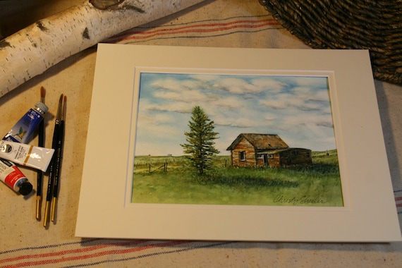
Montana has won my heart!  The breathtaking views offered daily are more than an artist could ever capture.  Whether it's a brightly colored sunrise, a gentle frost on the tree branches, or a purple mountain range that seems to go on forever, it's a land of inspiration.  One of my most recently completed artworks was inspired several years ago.  

After watching the annual Independence Day parade in Choteau, Montana, we were driving home.  We topped the hill and then I saw this fantastic sight.  The fields were such a verdant green and in the distance I could see bright yellow flowers, perhaps mustard.  The sky was clear, no haze at all, and just sooo blue!  The mountains in the distance were easily visible.  The well worn tracks along the fence line drew my eye to the mountains.  I was mesmerized and picturing how it could become a painting.  My camera was close at hand and we pulled off onto the side of the road.  

As I've said many times, my husband and children are more than understanding and patient.  They know how much photography means to me.  Over the years, they have become accustomed to a camera being in my hand.  It's very seldom that they hurry me along or distract my focus.  I am indeed blessed.

The photo by itself is not that awe inspiring, I must admit it's just okay.  It's bones are nice though.  The elements of design being used here make it work; it just needs a little tweaking and it will be exactly what I need.  The basic composition is made up of sky, mountains, fields.  The mountains are not cutting through in the center of the frame.  This creates more interest.  Add to that, the horizontal planes are divided unevenly.  The wheel tracks and the fence line both break up the lower plane at eye pleasing angles.  See, I've been working at this long enough, it's planned out pretty well when the photo is taken.


Thursday, October 22, 2015

Rock City Canyon and Riverscape Watercolor Painting

Painting A View of Rock City in Watercolors


The next watercolor painting in a series of five landscapes focuses on a view that's familiar to many locals.  There's an area known as Rock City, a short drive north of Valier, Montana.  It's not easy to find without specific directions.  It's definitely a place you'd call off the beaten path.  We've taken weekend drives to get out of the house and this is a free, unusual outing.  While going through my photo references, I came across a view along the river's edge.  When I took the photos several years ago, it was already in my mind as a possibility for a future painting.


The rock formations in this area are very unusual compared to the surrounding landscape.  The best I can describe it, you're driving through what looks like farmland and prairie going on forever and then boom, you're there.  The rocks rise up in these crazy and fun shapes and the kids can't wait to jump out and run from one to another.  There's grasses, low-lying shrubs and wildflowers...and it's smart to watch for snakes.  I am sharing all these photos to give a better perspective of the area where my painting's view originated.  A few of these photos have been altered with filters.  That's one of the ways I prepare a photo as an art reference.  I bump it up a bit to achieve more color contrast along with distinct shadows.  My artistic style leans toward bold, vibrant colors with a hint of impressionistic textures.  


Friday, October 16, 2015

Art Studio Progress: Montana's Big Sky and Farmlands in Watercolors

A peek at what's going on today:

Yesterday, I just couldn't take it anymore!  I had to clean up this place.  It was driving me crazy.  Fall is here and the wind can really blow in Montana.  Leaves are everywhere.  That includes my art studio AKA the solarium.  I've got plenty to do but the state of this room was more than I could handle.  The clutter seems to clog up the creative energy.

So by last evening, I was too tired to sit down at with brushes and palette.  It was great to start fresh this morning.  With so much time spent between the computer and cleaning in the past two days, it took some time to find my groove today.  That makes me nervous...working on a painting before I'm really feeling "it" could mean mistakes.  I tentatively press on, believing any mistakes can be resolved.  I battle between being too tight and too free in my manner.  I could really use some loosening up with color and technique most days.

I brought out nature items collected to display on the art supply cabinet.  I used this space for photographing artwork, prepping for Etsy listings.  Photographing artwork to look it's best is harder than I expected.  With much frustration, I'm learning as I go along.  Sometimes, I just want to learn it too quickly.  I want the answers now but that's not how it works.  It takes sticking with it, being patient for a better idea to come another day.  The balance between hard working while still relaxed enough to create...that's my task.  It's a joy most of the time.  Other times, I stomp my foot and growl, and then I move on.  I can be silly like that because it's just me and a kitty that is busy chasing her tail.


I'm not sure how to explain it but I'm feeling that this piece is close to completion.  I'm putting it aside until I can have a critique session, most likely with my husband at the end of the day.  I've got two other watercolor landscapes waiting in the wings.  I'm off to get going again.


-Christy
because she must make art.


Thursday, October 15, 2015

Weathered Old Place and Lone Pine Watercolor Painting


Capturing a Favorite View with Watercolor Paint


A familiar view to those who know the area well, I think of this as the lone pine painting.  I know that doesn't give much attention to the old building that is it's companion.  Admittedly, I do not know the history of this place.  What's its story?  I just know that it grabs my eye every time I reach the top of that hill at the top of the bench.  This roadside view is one that I have always enjoyed seeing.  My photos are quite old now.  With only a few printed photographs, they weren't on my computer's hard drive.  I scanned them so I would be able to pull them up on my tablet through the Picasa Tool.  I'm not going to explain it any further because the tech part is confusing every time.  I've been spending a lot more time on the computer since committing to art on a daily basis.  At times, I can feel frustrated because so many computer related tasks need to be done instead of picking up a brush.

The original sketch was done on tracing paper.  The photo shows the support board holding from top layer to bottom, reference photo, tracing paper, white cardstock (makes sketch stand out better), and graphite paper.  The graphite paper was made with a sheet of tracing paper, soft graphite pencils, and rubbing alcohol on a cotton ball.


The sketch is transferred to 300 lb. Arches cold press watercolor paper.  This watercolor paper is thicker with a medium tooth surface.  It can take wetter washes with very little buckling or bending.  I'm able to use more techniques without the paper breaking up as can happen with thinner papers.  The tracing paper sketch is layered over graphite paper and watercolor paper.  My fingers have the foam board strip as a resting place; this prevents unwanted smudges and lines being transferred to the watercolor paper.  During this step, I frequently (and carefully) check to be sure the drawing is really transferring so lines are dark enough on the watercolor paper.  Any shifting of top or bottom layer is a BIG uh oh.  I use a pencil with a harder lead, like a 2H, to make the transfer work better.


Checking the drawing that's been transferred to watercolor paper, I check for lines that need more defining.  There are plenty of soft smudges from the transfer paper.  After erasing away the smudges and unwanted lines, I use a brush to sweep away the eraser bits.


It's almost time to paint!  Pulling out a reference book, The Watercolor Painter's Palette I'll plan out key color mixes that match my vision most closely.  This book is one I refer to often because it shows what the color mixes will look like.  There are several pigments I own and use that are not shown in this book.  It's just handy and helps guide me in the right direction.  I usually narrow down my colors to a main red, blue, and yellow...gearing toward those that are more transparent and less staining.


I also refer to my stash of color mixing grids.  The mixing grid from the crocus paintings has some very nice greens.  The blog post, Painting the Crocus from July shows this grid with my reference set up.  It's still a great resource tool and worth the time it took to create it.  I'm much better at planning out my color mixing than other prep practices.  I know I ought to make value studies part of my planning process.  All these disciplines make the art better.


This is the color mixing grid I made before beginning the five landscapes, this painting included.  It's much simpler and and focused on key colors I wanted to achieve.


The drawing is ready on watercolor paper for the first strokes of color.  I've got the tracing paper sketches (I made an additional sketch for the tree) and reference photos close at hand.  If you look closely, you'll notice a white grid on the screen of the tablet.  The white lines are drawn onto a piece of acetate.  The acetate is taped to the tablet screen.  I'm going to to tell about this tool in a future post.  I am studying all my photos to pick those that best illustrate what I do with it and what it's for...it's most useful while drawing the initial sketch.


 I wasn't enthralled with my first efforts with this sky.  My frustration with the results increased and I nearly gave it up to begin again fresh.  My husband backed me up, agreeing that if I was that unhappy with it, start again.  I'm not sure why but I fought the urge to scrap the whole thing.  Feeling like I had nothing to lose, I did something a little gutsy.  I did a little reading online and then grabbed a magic eraser.  In the past, I'd been cautious enough that I wouldn't risk it on other paintings.  Why mess up what's already going well?  In my previous post, "Watercolor Landscape & Sky: Scotch Tape and Magic Eraser" I explain how I used the magic eraser to correct the clouds in this painting.  I am sorry there is no photo of the before, only the after.  It's the mistakes we usually don't want to remember, so no thought to grab the camera.  Next time perhaps.  I keep learning every day!

Once the first washes of green were laid in to the prairie portions, I was excitedly watching as it all came together.  With careful thought, I studied the textures of the weathered wood on the building.  I planned the layering of the color from beginning to last, base to top.  This photo is not as clear but still shows the progress in elements being developed.  The tree has masking fluid protecting its detail for later.


Now the masking fluid has been removed to show the white of the paper in the tree's form and taller grasses.  My evening critique (with husband's input) brought focus to the shadows being exceptionally dark.  I'm learning to wet then scrape back with a palette knife for more definition.  Wetting and scrubbing also brings back the light details in specifically chosen areas.


A view from above shows the layout of an organized work space.  Lately, this has been more disheveled and chaotic as I work on three at a time.  I'm fighting the nagging feeling that cleaning needs to be done.  The priority needs to be finished paintings and a few quick clean up sessions can come later.  Breathe.  Just breathe and focus.  Continue to press on.


This art piece has taken me on a journey of persistence.  It's been an incredible experience to begin and finish eleven paintings since June.  I'm celebrating sixteen weeks of dedicated focus on my artistic goals!  At the beginning of my self-given challenge, I had felt lost without purpose for this creative energy.  I didn't schedule my days with art being a priority.  I didn't know how it could be possible.  With great curiosity, I searched to find artists that could be creative daily and raise a family.  I wanted to have it all spelled out, like "The Dummies Guide to Being An Artist, Wife and Mom."  Nope.  It's not in print.  Without finding a definite "here's how it's done" plan, I am discovering it as I go along.  We are communicating within our family to find out what we all need.  I am letting the house be less than perfectly put together.  The laundry, ironing, and cooking are not always done like I would prefer them.  If I don't relax my expectations, I'll have to give up the creative pursuit again.  If you stop by and see a cluttered home, it's because I've been painting today.


This painting is now available on Etsy at ChristySheelerArtist.
If you have not been to my Etsy shop, I invite you to go see the selection available there.


Copyright 2015 Christy Sheeler.  All Rights Reserved.


It will also be matted and framed to hang in a local restaurant.  I'll share more when that step has taken place.

On Facebook, Google+, and Instagram, I share more frequent snapshot views of progress through out the week.  You can find those listed on my Contact Page.

So that's my bit to share for the week.  I'm excited to be able to describe the work going on with my palette and brushes.  Next week, I'll give a beginning to end progression of another painting.  If you're familiar with the Rock City natural formations, you'll want to stop back.  I've chosen a view from the river's edge viewing the rock cliffs and hills above.

Until next time,

-Christy


because she must make art.


Wednesday, October 14, 2015

Watercolor Paintings In Progress This Week

Watercolor Painting Update!

I am popping in today because I just want to share these photos today!
This is an update to Quick Glimpse of Watercolor Progress, the previous post from Monday. 
Tomorrow's post is waiting to be completed so not much time to chat...

I've had such a positive response to this sky!  The fields are really popping yet the most distant hills still need a little bit more definition.  I've had such a blast choosing the color mixing combinations throughout this piece.  

I decided to work between all three paintings during my last work session.  I think this is out of caution, stalling myself from jumping ahead too soon.  Taking a pause from working on a specific painting is a very good thing.  I don't want to overwork the painting and have regret later.  I'm finding that seeing paintings photographed and on the monitor helps a great deal.


The colors of the mountains are so light and loose, suggesting the landscape without a lot of detail.  The fields are still too bright so they will have more color washes and detail added.  For the life of me, the fan brush is giving me a challenge.  I'm going to have to do a little practice on the side.  I'm not completely satisfied with my technique yet.  The road may be getting a little spatter or sponge to give a tad more information on its textures.   The fence posts need a lot more color and definition.  The fence wire hasn't been added yet; that will be one of the last details added.


So this piece gets to be last for whatever reason...not sure why.  I believe the sky is done but I'll see how it looks as a whole later.  I believe this painting is now in its awkward, challenging stage.  The fields are getting their base washes of color that are the foundation for colors and details yet to come.  The bold golds will give a richness to to dark greens that come next.  I'm pushing myself to be more free with the fields in the foreground.  The washes in the foreground popped more before it dried.  I'm seeking to be sure the fields do not compete with the sky.  The fields and sky need to work together well or it will be confusing to the viewer's eye.


So, have you answered Monday's question?
I'm so curious to find out about how others channel their creative energy.

If you missed the question and you're curious, here it is again...


Quick Question:

If you were to use paint to capture a scene in your mind, what would it be?  What type of paint would you use...or what other medium would you choose?


Okay, so now I'm off to get the post ready for tomorrow.  I'll be sharing the photos taken, beginning to finish, of one of the completed landscapes.  I'm so excited to share them!

-Christy
because she must make art.


Monday, October 12, 2015

Quick Glimpse of Recent Watercolor Progress

What's happening today?


Well, two paintings are being flattened under a stack of books.  They will be fully flattened tomorrow and then comes the dreaded signing.  I always stress over my signature.  Is it straight?  Is it weird?  Is it just right?  Re-do is not an option.  Over thinking again.  That's me.

Three more landscapes are mid-process with their skies completed.  It's time turn my focus to the land part of the compositions.  Who knows what little challenges lie ahead, causing me to rethink my techniques.  What techniques will work best to achieve the desired effect?

I was able to get further along on two of the three remaining landscapes.  An ivory mat laid on top gives me new perspective on how the whole composition is coming along.  It's a tough thing to decide how much color an area needs.  The saturation of color affects the contrast but too much is not always a good thing.

This is a view of the whole setup in front of me while working today.  Changing out the water often is very important.  I have another tub of rinse water to my right, out of view.  The roll of toilet paper is wrapped with paper towel; this is where I blot extra water out of clean brushes.  Too much water left in the brush will travel up the bristles into the metal ferule.  The end result is that extra moisture is absorbed up into the wood handle and the result is cracked paint on the handle.


At times, it feels like a good idea to take a break and set the painting aside.  I'll set it on an easel across the room.  As I pass by, I glance at it to see what stands out as an area needing changes.  In the evening, I'll call on my husband for a critique session.  Over the years, we've done this so often, we complete each other's sentences.  He begins and I can guess where he's going with his thoughts.  Another person's point of view is an incredible tool in deciding what still needs work.  The painting below is from the "Cut Across" road; we were coming back from the Fourth of July parade in Choteau.  My husband loves this one most right now because of the wheel tracks leading along the edge of the field.


It's all I can do to keep myself from grabbing the camera right now!  I would love to show all the changes that have taken place in the past two days.  Why not?  I 'd never complete the painting.  I'm going to be disciplined and get back to work with a brush in hand.  I'd like to plan another update later in the day...although it may be a very short addition below.  


Another blog entry to come again on Thursday...check back and I'll show off a previously completed landscape painting.  The watercolor palette is calling my name so I'm heading back to create for today.

I have two new landscape paintings to be added to the Etsy shop in the next week.  If you have not been to the shop, click to go to ChristySheelerArtist.  I've been taking more photos of each painting to give more variety of views for each listing.  Those will be updated in the coming weeks.

-Christy,
because she must make art!

Quick Question:

If you were to use paint to capture a scene in your mind, what would it be?  What type of paint would you use...or what other medium would you choose?


Thursday, October 8, 2015

Josephina's Tea Party Watercolor Painting


A Doll's Tea Party Watercolor Painting in a New Frame

It's been a busy week moving in many different directions!  I'm continuing work on five landscape paintings which feature local views.  I've just completed number two, a view of the Marias River in the Rock City area.  I had no idea how much time this one would take...  In my mind, there is a sense of the place I want to capture and communicate and that takes time.  There are elements of the moment captured with camera that I so badly want to keep.  In the next three days, I'll resume work on the other three landscapes.  Their skies have all been laid down previously.  The fields and plains are yet to be finished.  

There's a pocket door I have acquired with plans to clean and repaint for a photo backdrop.  Etsy offers the option for five photos to be shown for each item listed.  With use of all five photo options, giving varying views especially in a mat and frame, the potential buyer has more information for purchase decisions.  My goal is to make the door my backdrop for displaying the paintings with mat and frame.  In addition, I'd like to have the option to add natural seasonal items for best presentation.

Recently, I've done some work on greeting card building as well.  I look forward to showing off progress in these different projects.  With frosted vellum I'll soon be creating overlays with printed text.  These will be layered on top of select photographs or prints of my artwork.  I've also got a supply of frosted shrink plastic; I'd like to fashion little tokens to be added as an extra beautiful detail.

So all of this has been incorporated around a busy family schedule with orthodontist, football games, medical appointments and more.  Yesterday, I had great initial plans to make big progress in the studio early in the morning.  Then I realized that much of our home was in need of my attention, so I spent the day with cleaning and laundry.  Of course, the housework is never completely finished; I'll be cleaning floors again soon.  Now I can sit and work today without the dread of housework looming.

My main focus for today is this brightly sunlit painting of  Josephina, an American Doll, seated up high on thick books, enjoying a tea party.  We've just recently taken part in a benefit for a local family.  Their daughter was the recipient of a liver transplant in July.  The fundraiser was a community effort to help with their travel expenses.  I was excited to be able to contribute and this painting seemed ideal.  It occurred to me that it's time to start including my children in the decision making.  They are in their teens but someday they may want to have pieces of my artwork for their own homes.  They were fine with letting this painting be donated.  They pointed out which paintings they'd like to have kept for now.


The one problem with this painting, in my mind, was the mat and frame.  I'm sorry I did not photograph it for before and after comparison.  It had a pale yellow top mat and navy inner mat along with a narrow navy wood frame.  I just couldn't give it as it was; it needed an improved mat and frame.  I attempted to paint the frame but it was no longer strong in corner construction so I bagged that idea.  A pale wood frame here in the studio was the beginning of my solution.  The color of the wood was so pale and uninspired!  Some kind of face lift was needed.

With bottles of Folk Art chalk paint and antiquing wax, I was able to give the frame a very different look.  I began by brushing the chalk paint onto the frame, carefully covering all surfaces seen when the frame hangs on the wall.  I let it dry for about an hour.  After the first coat, I did a little more to touch up for full coverage.  I nearly forgot one outside edge which would have been embarrassing later!  A little sanding in areas helped to keep the roughness in check.  Applying the antiquing was was a little trickier because it takes such a light touch.  A really stiff brush helps for better application.  I used a cloth to wipe away extra wax immediately.  I let it dry again until it was not as tacky to the touch.  With a cloth, I buffed the whole frame to bring out a bit of shine.


This is the painting and mat sitting beside the frame.  You can see I did not paint the back of the frame.  The paint could easily be transferred to the wall and we don't want that.  There's enough housecleaning to do as it is!  The glass has been cleaned with vinegar and a soft cloth on both sides.  There's just something about assembling a painting with a frame...there is always lint or debris that stays no matter what.  This painting had to be removed after it was all complete because even with my great care, there was still two tiny bits of unwanted debris inside.  Ack!


My next step in the process:  mounting the painting to the foam backing board.  One of my aunts owns a frame shop and much of her instruction stayed with me.  The mat or the backing board is either attached to the back of the painting at the top edge.  The painting is able to expand and contract without resulting in the watercolor paper buckling.  Below, there is a view of the work space at this stage.  The hairdryer and brush are to remove all remaining lint.  The damp blue sponge is sitting on a plastic tray.  The roll of acid free linen tape is what I use for hinging the painting on the mat board.


This is the when I recall my aunt using weighted bags to hold the artwork in place.  In quick, problem solving motion, I grab a rice filled sock.  (Why do I have this?  We heat it in the microwave and use it to soothe sore muscles.)  This will do the trick just fine!  What I have done is this:  I've placed a cut piece of foam board on the bottom, the painting in the middle and mat on top.  These three are sandwiched in a way so the painting is positioned for the best view.  The sock weight is placed on the painting and then the mat is set aside.  The painting is held in position while I apply the linen tape hinges.  You can see that the back of the box has instructions for two types of hinges.  I chose the one on the left.  The gummed tape is torn and then dampened on the sponge.  It's called a T-hinge because of how the two pieces are arranged for each hinge.


This photo is a better view of the two types of hinges.  Acid Free gummed linen tape holds the painting to the foam board.  It is only hinged at the top.  It's difficult to see but I used the T-hinge method.  The linen tape is not really visible, I'm sorry.  It's just too similar in color with the foam board.


The painting is now attached to the foam board and the mat is set on top.  Here is the point at which we must be super picky about little hitch-hiking lint.  I think I should have used paper towels or flour sack towels.  The microfiber cloth just didn't perform like I'd hoped it might.


The three parts (mat, painting, foam board) are placed into the frame face down toward the glass.  Using the screwdrivers, I carefully bent the staple brackets down over the foam board.  The painting is now securely sandwiched in and I can hardly wait to see how it looks from the front.  


Without double-sided tape on hand, I chose a different method to attach the dust seal on the back.  I wish I had not attached the hanger earlier.  I have done these steps so infrequently that I forget what steps should be done in what order.  This has been a great refresher!  The double-stick tape or a dot glue runner would work much better by far.  I have a large roll of gummed kraft paper tape so I chose to use this for the sake of completing without another supply run.  The dollar store sells brown kraft type wrapping paper and foam board which is such a great find!  


I did not photograph the following steps...it was a bit sticky.  I needed an extra set of hands.  I measured and cut the wrapping paper to cover the back of the foam board.  The gummed kraft tape was measured and cut for all four lengths.  The piece of kraft tape for the top edge needed to be cut to allow for the hanger to be exposed.  I used a spray bottle to wet down the back of the tape.  It's useful to know now that the gummed kraft tape works but not the easiest application.


This is one view of the finished work all ready to go...the mat and frame are such a fantastic improvement!  I love the look of the chalk paint and antiquing wax; they added to it without distracting from the artwork.


With a business card on the inside edge of the frame, I'm nearly ready to drop it off for the benefit auction.  I almost hate to see it go!  With so much effort in every piece, it can be difficult to part with each one.

The story behind the painting:

This painting was the result of a summer Saturday spent outdoors with artist friends.  This arrangement was placed in the center of Athena's backyard.  Great attention was spent on every detail to place each item with care.  Each artist brought her art supply bag and a food contribution for lunchtime.  We chose the vantage point that best appealed to us, scattering to tables for work space.  The chatting hopped from one subject to another.  When the neck gets sore or legs need stretching, we'd get up and wander to see progress going on with others.  The camera was needed for the necessary reference photos but back then (ooh, I feel old) it was necessary to take them somewhere to be developed.  No digital tablet or cell phone with camera.  My style has continued to develop since this painting came about.  Those days of art club were just so precious because we challenged each other and shared our knowledge.  We weren't competing; we were encouraging.  There's a gift in having camaraderie...working alongside one another.


One final touch:

There was one last special touch I made sure to remember in order for this to be complete.  Sometimes, when I donate a piece, they are mistaken for prints.  There's a big difference between an original painting and a print.  Huge.  There's planning, prepping, supplies, working through techniques, researching methods, and many hours.  There's great effort taken to complete a painting from inspiration to last brush stroke.  Such care and detail is given that is not there in a print.  Prints are nice for the pocket book  but they do not retail the same as original artwork.  From an artist's point of view, I need the viewers, bidders and buyer to be aware that this is the real thing, not a reproduction.  On the back dust cover, a business card attached and a handwritten note:


Now Josephina and her tea party are ready to go to a new home.  A place where she'll be enjoyed daily.  It's gratifying to know that what I've poured out on paper with a brush is being appreciated by another.  Someone valued it enough to make it theirs.  Thank you to those who have done so for me or another artist.  I'm sure with all my being, we would still carry on creating art regardless... but it is the highest compliment to have another seek to have it in their own collection.  There are probably more than 25 paintings of mine purchased and now in private collections.  I've been painting for over 25 years and have never kept a written record of artwork purchased.  That sounds crazy, I know.  Now, I wish I had written it all down.  This may be a low estimate, it's hard to accurately remember.  I feel a deep appreciation for those collectors.  At some point, it would be wonderful to have photos of each painting as it hangs in their homes!  Maybe through the blog and other social media, I can begin to record these now.

If you have a piece of my artwork hanging in your home, would you please be willing to send me a photograph to christysheeler.artist@gmail.com?  I would be glad to share it here, with your permission.  I've got some of these paintings shared on Pinterest; I can share that they are in your private collection as well.

Oh, this has been fun to share with you today!  I hope you'll continue to return so I can share more about this artistic journey.


-Christy

because she must make art.


Thursday, October 1, 2015

Watercolor Landscape & Sky: Scotch Tape and Magic Eraser

Easy Watercolor Techniques For Landscapes

Have you been itching to try watercolor painting yourself?  Are you just a little excited to get your hands on a brush?  Today, I'm going to show two techniques that anyone can use.  

When painting a landscape that has more complex details, keeping the sky color separate from the land portion is a challenge.  It's easy for watercolor to spread over where you don't want it to be.  Keeping a paper towel ready makes a quick blot possible.  Sometimes, we just need a few fluffy white clouds in the sky so we'll add those, too.


Materials:

Watercolor paper
Scotch tape
Box knife or razor blade
1" flat brush, synthetic is durable for watercolors
Watercolor pigment in blue hue of your choice
(ultramarine or cobalt, add a little cerulean for variety)
Eraser cleaning pad
Scissors
Container of water


Scotch Tape with Watercolor


1.  Here, I've drawn a few basic lines to imitate the planes of a landscape.  The top line separates land from sky.  This is where we have possibility of paint spreading from sky area.  With this simple line, I would just turn the painting around with sky area closest to me.  This trick is key for landscapes with more varied or complicated shapes.  If the paper is clipped to a support board, then it can be tipped at an angle so paint runs toward the highest point of sky.  You can rest the board on a roll of masking tape to keep the back edge higher.