
Spring is finally here! The shooting stars said so.
 |
| Shooting stars blooming abundantly with a few Indian paintbrush |
It’s spring fever. That is what the name of it is. And when you’ve got it, you want — oh, you don’t quite know what it is you do want, but it just fairly makes your heart ache, you want it so! ~Mark Twain
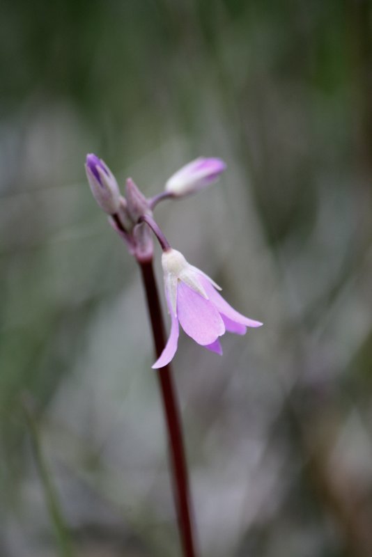 |
| The color and size of the shooting stars vary. |
"Oh, look! I see them! Quick, stop, I'll be right back."
These words are followed by me grabbing my camera and jumping out of the car. I wander the roadside ditch for the next 15 minutes, searching for the best and brightest blooms. Aware that my family is patiently waiting for me during a pause in our drive to wherever we are heading today. This has been our habit for so long that no one complains; there's no impatience because this is our normal. I can pass up boutiques and coffee shops but I brake for wildflowers. For me, nature sends delightful little messengers of spring in the grassy wet areas. I glance around for the amount of standing water, hoping to keep my feet dry. It may sound crazy but I'm like a child at a parade, watching for candy to be tossed my way. That's how it is for me while I'm anticipating the growing season for each wildflower. This vivid fuchsia flower on slender stem has a lovely scent, as gentle and pleasing as lilacs or roses but still distinctly different.I am not sure how commonly this flower is found in other areas of Montana. I know that they are predictably found when it's wet enough along what we call the Choteau cut across road. I know the spots along the road between turn-offs and where to keep a sharp eye scanning the ditch and fields. Why do I feel this strong pull to seek them out? It might have something to do with anticipating spring's return to north central Montana.
In the Midwest, as a girl, I liked flowers but didn't really have an awareness of wildflowers at all. My dad would take the family fishing at some local pond frequently. He has always loved fishing. My problem with it was the heat and the bugs. I remember wildflowers but didn't really feel wowed by them back then. When returning to the Sandhills of Nebraska, I am now aware of the variety of wildflowers blooming there...I was distracted and unaware as a young girl. During those years of growing up, we took trips usually every summer. A few trips led to the Black Hills of South Dakota and several to the mountain area of Paonia, Colorado. We have family there in Colorado and it was always a relaxing, peaceful time catching up and enjoying one another. That's where I discovered my love of the mountains. I talked about that someday when I'd be grown up, that's when I would go to the mountains. At 22 years of age, I moved to north central Montana to be a third grade teacher on the Blackfeet Reservation. Wow! Blessed to have a dream come true, I now live on the prairies about an hour east of the mountains.
So many years later, the deeply enriching, soul balm that the mountains offer is a gift. All winter long, I wait through the snow and cold (oh, even past twenty below) days upon weeks upon months to reach the other side. Winter has its beauty and serenity but then the joy when spring is here again! During my first few years in Montana, I really didn't grasp the great number of wildflowers that bloom here. I purchased the National Audubon Society Field Guide to North American Wildflowers to be able to identify those that caught my eye. It's a thick and impressive resource to have. And then, I purchased two more to have a pretty sure chance of knowing their names, where they can be found, and what time of year they bloom. Along Mountain Trails (And In Boggy Meadows) by Doward and Swanson covers wildflowers and berries of the northern Rocky Mountains. Plants of Waterton-Glacier National Parks by Shaw and On is another great resource. The two latter books will tell how that plant was used by Native Americans. On a recent trip to the mountains, my daughter joined in with helping identify the wildflowers. One turned out to be a type of nightshade and deadly poisonous. Glad I didn't decide to nibble on that one! (Relax. Seriously, I only eat the berries that I'm sure of and that still makes my husband nervous. We'll save the berries for another post. I can't help admitting I enjoy seeing him like that though...aw.)
"Nobody sees a flower really; it is so small. We haven't time, and to see takes time - like to have a friend takes time." - Georgia O'Keeffe
As spring arrives in Montana, the days are still very cool in May through June. You say you've always dreamed of visiting Montana? Are you accustomed to the warmer, milder climates? My parents live in Austin, TX and they gave up on coming before July several years ago. They froze when they came in June because it's that much cooler and dryer here. If you want to have hot summer weather while you're in Montana, July is your best bet. That's not a guarantee, but there's a better chance of seeing temperatures in the 80's. Many here could tell stories of seeing snow in every month of the year. We live here because we love it and couldn't imagine life otherwise. We are in the far north and our long winters reflect that. I realize this is not Alaska, but for everyone else in the rest of the continental U.S. we have a long wait for winter to finally be over. Late October until late May, it's any one's guess. I'm originally from Nebraska and even after 20 years here in Montana, I still long for spring at least a month before green grass returns to my lawn.
 |
| This is farther north along the road toward St. Mary's and Glacier National Park. |
Every spring I continue my pursuit of wildflowers, exploring the ditches, fields, meadows and mountain trails to capture more photographs for watercolor paintings. There's a mental thought process that goes on, calculating which flower type collection is most lacking. Currently my photos for the shooting star are just over 200 total but on second glance, several are out of focus. While analyzing the sprigs of flowers in the tall grasses, I'm looking for the best blooms in color, shape, height. Any buds that are unopened are a bonus. Little buds could be added with my pencil to complete the overall composition. I must admit that I'm still not as skilled with my camera's settings as I ought to be. Most often it's on auto settings and someday I'll focus on learning more camera skills. For now the manual settings are getting me what I need in a reference photo. I can only do what I can do...there are more options for learning and improving in another season of life. While peering through the viewfinder, I study to decide a vertical or horizontal shot (or both) and if the surrounding area is simplified enough. If I were to sit down and begin drawing this, would it be too busy? Are there too many details to distract my eye? I love the reference photos that focus only on the main flower subject itself and all else is blurred and softened. I have some photographs, mainly from my earlier years, that are so crazy busy with details that I wouldn't know where to start. Some of those early photos I tried to draw and paint from. Now I realize why I got lost and felt like the work didn't accomplish what I wanted from the beginning. I started out with reference photos that had too much going on and without a clear focal subject. Another design/composition guideline is to have odd numbers. This came up while my husband was critiquing my work recently. He couldn't put his finger on what about the painting was bothering him. Then he remembered I like to work in odd numbers but the painting's flowers were an even number. It may sound unreal but there's so much planning that goes into artwork based on how the elements affect the viewer.
 |
| This is an example of a busy photograph; too much going on and hard to decide a main focus. Here, shooting stars and prairie smoke flowers. |
Picasa is the photo software I use to crop and edit my photos. It was recommended to me years ago for web album sharing with family. I send the link in an email and photos are only seen by those with the link. This made it secure to have control over who views our family photos. Now I use it to touch up shadows, contrast, bump up the saturation of color just a touch and so on. My reference photos work even better this way. I've been able to organize my photos into albums by the specific type of flower which is an invaluable help for painting planning. I'm able to upload web albums that I can open on my tablet. No more need to print off reference photos. I turn on my tablet and pull up the photo in the Picasa app...or the Google Photos app (a pinwheel icon). Zooming in on the screen is such a bonus on top of it all.
 |
| This was taken in studio with a solid background, cropped and edited in Picasa. I used the HDR filter and added Cinemascope for the letterbox effect. |
Some photos are just so pleasing as they are and may never be used for a painting reference. The photo above has been cropped quite a bit from its original. I did use this one, without cropping, for a painting reference.
 |
| I just love this unique view. A little cropping and this one's ready to draw. |
Unusual perspectives are so much fun! My eye carefully studies the position of the petals, the angles created by its parts, and the lines of the stem and leaves. There are some extra grass blades that are distracting here but easy enough to ignore while I draw my sketch. This photo gives me direction in the mood with hues and values. This image is not so bold and striking...it is a restful and graceful pose with calming shades of color.
In past years, I worked on a trio of paintings all at once. My sketches of oriental poppies were drawn from both studying the cut flowers and photographs. It was an enjoyable and successful experience until I had to put down the brushes for an extended amount of time. I learned that stopping mid painting is not a good thing. I described this problem in an earlier post Nature is Such Bliss. I've played around with using different brands of watercolor paper over the years. Arches now remains one of my favorites. It's tried and true to be reliable more often than not. If you take a break in the middle of a painting there are a number of reasons to return to it soon. One, keeping track of reference photos and color mixing swatches/notes. It's more work to regroup later and gather everything up again. You'll lose track and get out of your rhythm for that painting. Two, the paper has gelatin sizing that keeps it from instantly absorbing the paint. This means you can work with the color on paper for a little longer before it dries. Changes in temperature and humidity can affect the paper sizing. When that happens, watercolor painting becomes an extreme challenge. In the case of the poppies paintings, acrylic gesso, hard chalk pastels and watercolor pencils saved it to a certain point. The background of number three could never have unity with the other two paintings. Working on paintings in threes, good. Stopping before all three are done, not good.
 |
| An earlier painting from 1999 shows how my style and skill is changing over time. |
On a separate piece of watercolor paper I mix a few combinations with pinks/reds. Permanent rose, rose dore, rose madder genuine and quin. rose were the pigments I chose. I was curious about how these would mix with cadmium yellow light so I tried a mix with each one to see their bright orange results. Next, I did the same with ultramarine blue...seeing how it would mix with each pink/red.
 |
| Color mixing guide labeled Shooting Stars will be kept to use for other paintings in the future. |
Several hours are now invested but the painting is finally about to begin. So much work and still not a drop of paint on the watercolor paintings. It's worth every bit of planning and preparation because midway through the painting gets a little challenging. After carefully adding masking fluid to protect delicate areas of the flowers and letting that dry, I am ready to begin. The background is laid in loosely with fun areas of salt and blooms to give it a softness. Working my way around the painting and right up to the edges of the sketch, I keep the leading edge damp to avoid hard edges forming in the background area. A larger brush, flat or round, wet with clear water is used to keep the paper wet so it has continuous flow. This gets tricky when working in multiple directions at once. I can usually go back and re-wet an area that needs softening because a hard edge dried in earlier work.
When working on the main subject, the flowers, I work from lightest to darkest values. It builds layer upon layer while studying the warm and cool areas, the light source and the direction the petals are turning. Midway through I notice I'm not loving what I see as much as I had envisioned. I think this is the awkward stage where there is less contrast and detail. It's still too early to add the full values of dark shadows. It feels uncertain as I feel my way through how it needs to progress.
Would you like to see what they would look like at this stage?


I've used a variety of brushes but now use both synthetic rounds and flats plus a few sable rounds. The sable hold more pigment but the synthetics hold a better point for me. The inexpensive synthetics are best for scrubbing out to lighten up specific areas.

The finished work with blues in the shadows and bright lovely yellow tips. I love the graceful movement of the turning petals.

I was so excited to tackle the uncommon perspective here. I love showing it from a different view than would normally be expected. The bold red detail on the flower at right is so striking.

This is a standard perspective but still so interesting to see the points angled from the center. The petals of the flower at lower left are closely arranged with striking variety of pinks. I enjoy how the red details on yellow and white areas complete them.
At this point I can't give a number on completed watercolors ready for sale but it's growing! I'm trying not to be stressed out by what I still need to do. I'm just thinking about finishing the present work in progress and taking photos as I work. I am considering future blog posts as I paint in the studio. There's still so much to learn before I can even think about beginning with Etsy marketplace but I'm determined not to let that scare me. For the moment, I'm finishing up another set of three paintings and thinking on making my own business cards. The paintings that are now completed need to be packaged in a pre-cut mat and plastic sleeve packaging. I'll attach my business card to each one on the back. We've been talking pricing and that's exciting. In the next few weeks we might even dive into selling at the Farmer's Market in Great Falls, Montana. Wow! I'm nervous. I've got several more new posts in beginning stages at this time so looking forward to sharing the continuing saga of artist momma...the adventures continue!
Until next week...
-Christy
because she must make art.
No comments:
Post a Comment